


|
Color Mixing in Oil Pastels
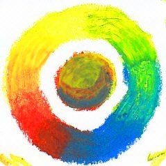
Color mixing in oil pastels can be complex. Every brand blends differently and each color mixes differently because of its pigment, binder and texture. Blue and yellow don't always make green. Above is a primary mixing chart for Sennelier oil pastels. This was done with three sample pastels that I got as the Sennelier sample from Dick Blick. They are well chosen to create clean secondary colors. My scan isn't perfect, but you can see that a color chart made up of six individual sticks would look very different. My mixed purple leaned strongly toward the red at a fifty-fifty concentration -- the red's a stronger color. My green came out good and bright, leaning toward both yellow and blue evenly. My orange leaned toward red at fifty fifty. That shows me that even in a balanced triad capable of mixing all three secondaries, one of the colors is so strong it overwhelms the other two in combination. When I used all three colors together to create a neutral, instead of gray I got something closer to a red-brown -- the mix of red with a little bit of green instead of even amounts of equally strong green and red together. Most of the time if you put a red, a yellow and a blue together, one of the secondary combinations will come out muddy or weak. A blue and a yellow that make a good green will result in a color wheel that makes a grayish color instead of a vivid purple. A red and a blue that make a good purple will wind up with a grayed green on the other side, or a murky brown for orange. The reason for this is that most primaries aren't pure. The pigment color leans one way or the other. An orangy red mixed with a pure blue is actually a mix of all three primaries -- the yellow cast is going to mute the purple to gray. This is the most common bad combination I've found in any medium. It can be cured by using Magenta for your red. If your red is strong, bright and purplish cast, it'll still make good oranges but will blend with a clean blue or a purplish cast blue to make a good violet or purple depending on proportions. Magenta is a color I consider essential in flower palettes and anything where I want a full spectrum for this reason. Pink and blue make better purple than almost any red with blue. Yellow and blue suffer the same problem -- bright greens come up best with the least orangy yellows you can find. Lemon yellow makes a good bright green with most blues, but it will start to lean toward olive when the blues are purplish. A good watercolor triad for balanced color mixing is the one recommended by Winsor & Newton on their site: Permanent Rose, Lemon Yellow and French Ultramarine. While the French Ultramarine (often just called Ultramarine) has a slight lean toward purple, it's still a clean enough blue to make decent usable greens with lemon yellow. You still won't get a bright mid green with it. So adding Pthalo Green to your palette is a good idea, or any other bright green. Now we come to the other factors... the binders, the way the binders affect how colors mix, the size of the particles and how finely they're ground affect color mixing too. Maybe that Sennelier Permanent Red is so strong because the pigment particles are smaller than the ones in the blue or the yellow. If they are, then you'd have more pigment filling the little spaces between the bigger particles and an even amount of both will have more red area. On top of that, each brand of artist grade oil pastels has its own large palette of colors and tints. Some of Holbein's tints are one step lower in lightfastness rating than the masstone (pure pigment color) of the same color range. Transparency matters too. A more opaque pigment won't so much mix as cover up the other pigment in a mixture, but a transparent one may glaze over it. Which color goes on top may make a big difference in mixing. Given that immense complexity, how can we discover which combinations work and what our favorites are for different things? Well, let's start by organizing it one brand at a time:
Green is a Special Case!Mixing Greens
Mixing greens is a challenge especially in landscape painting. They can look garish in large quantity, especially if grass, trees and shrubs become a monochrome wall of green. It's even tougher in oil pastels because there's a natural tendency to overuse the bright colors. This article shows some ways to combat the "wall of green" and keep your paintings lively!
Mixing by BrandsSennelier Mixing Sennelier's palette seems to be organized by and for oil painters. These smooth, super-soft artist grade oil pastels include traditional oil painting pigments and multiple variations on primary colors with different opacity, transparency and subtly different hues. Mixing patches, tests and charts are probably more important with this brand than any of the others as they create wonderful surprises! Holbein Mixing Holbein's palette is a Colourist painter's delight. Soft, creamy opaque square sticks cover easily and mix the way thick paint might. Be sure to mix with the lighter or weaker pigment on top and test your mixtures before applying them to a painting, or they may cover too well. My favorite brand of artist grade oil pastels blend so well even in three to five color combinations that I was able to produce smooth blends in any color I needed from only a 12 color set. Neopastel has a balanced chromatic "designer" range similar to large gouache sets and other designers' art supplies that can be a delight to the serious artist, especially with a background in soft pastels or colored pencils.
Test your MixturesMost of the brands I haven't written mixing articles on lean toward a chromatic-designer palette in the larger sets. Analogous colors retain their brightness when mixed. They keep the same intensity and if they're close in value, they don't change much in value. Color mixing becomes a matter of finding the precise intermediate hues or carefully darkening or lightening to intermediate hues. My charts may help but you will find that no scanner or digital camera comes close to distinguishing hues as well as the human eye. Color mixing can be done precisely using complex systems such as Munsell color space, something that allows even full or partially color blind artists control of hue and printers a good way to approximate the colors of original artwork. Colors expanding outward in a cylinder or sphere as they interact with each other. The center becomes more muted as colors mix across while lighter and darker mixtures go above and below the masstones at the equator. Munsell color space also has number and letter combinations that can precisely place any color according to its value, hue and chroma in relation to any other color. Books and software are available to study Munsell color space in depth and the Huechroval soft pastels book uses it to organize matching colors across different brands of pastels. Huechroval is planning an oil pastels supplement that may be of interest even if you have no interest in soft pastels. But the best way to predict the exact mixtures of the sticks you own is to fool around mixing them on a page again and again to discover what they'll do. I tend to read the theory, study it and then mix intuitively. Oddly enough, the larger a range I have, the more tempted I am to use complex mixtures to reach exactly the hue I want -- just muted enough, just yellowed enough, just lightened enough to match that particular end of the flower's stamen.
The color range is close to Neopastel just as the texture is close to Neopastel but a little more firm. However, more of the dark colors are transparent or translucent and this affects color mixing quite a bit. Cretacolor Aqua Stic The binder is categorically different on watersoluble oil pastels, so color mixing is affected by the texture and translucence. They seem to be midway between opaque and transparent, with more opacity in the light tints. A firm texture means blending isn't as complete, and thus may not be as muddy. Cray-Pas Specialist These are firm and the one color I have is a somewhat transparent dark green. It's strong and mixes well with other brands. Color mixing charts with these will have to wait till I get a set of them. Van Gogh Extra Fine Artist Color mixing with Van Gogh Extra Fine Artist oil pastels may be closer to Neopastel because the one stick I have is quite opaque. It is firmer though, so I'll see how well it blends when I've got a set of them to test.
Study Color TheoryBasic Color Theory For more about color mixing in general, this page on the color wheel, color mixing in general and basic color theory is in the Basic Drawing course on the nav bar. When using student grade oil pastels, read through the descriptions of mixing with the artist grade brands and most of all, test the pastels you own in all the combinations you'll use most. It helps for landscapes to systematically try mixing every yellow, orange or brown with every blue to get a good range of greens. For florals, try mixing white with every bright color and especially pinks or reds to get a full range of tints, some flower colors are naturally tints to begin with and then shade even lighter. Portraitists will need to mix skin tones for each unique complexion. Your favorite subjects and even the specific painting at hand will demand unique mixtures, so that's a good reason to use paper a few inches larger than your intended picture size. Mark up wide margins and then use them to test color patches till you have exactly what you need in relation to the rest of the painting. Be sure to test your swatches next to what'll be next to them -- adjacent colors affect brightness and hue more than you'd think.
|
