


|
Color Theory
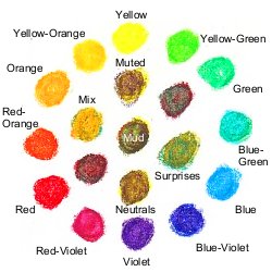
Color theory and mixing begins with the color wheel. You've probably seen many versions of this, some with only six colors, others like this with twelve. Yellow, blue and red are Primary colors, the ones that if you were working in oil paint, acrylic or watercolors you could blend all the others from provided you had exactly the right pure pigments. That's where color theory falls down when it meets reality. Notice the seven dots in the middle of my color wheel. Very few pigments are exact hues (the color it is) precisely balanced on the color wheel. They lean a little this way or that. When all three primaries are there in a mixture, you get a muted version of one of them, a neutral like brown or gray, or that mess in the center that I titled "Mud." The "Mud" patch includes all the primaries and all the secondaries I used to draw this color wheel. "Mud" is not an official term in color theory. It's used when a neutral color appears by accident in part of the painting where it isn't wanted, or when the whole painting appears dull and muted. It comes up in critique often. You don't want mud to happen by accident in a bright passage. Secondary colors are orange, green and purple, the colors of Mardi Gras in New Orleans and the colors that fill out a rainbow spectrum on your palette if you don't like getting murky, muted versions of them from mixing inexact primaries. In a dry medium like oil pastels, colored pencils or pastels, it helps to have strong secondaries in your lineup unless you are very careful in choosing your primaries. Dry mediums are often used to illustrate color theory because a large set of colored pencils or oil pastels or pastels will have close gradations between the hues evenly around the spectrum. You can find a specific red-violet that's redder than violet and twice as red as blue-violet, and maybe find tints of each of those in a big set. Tertiary colors are both the bright combinations mixing a primary with a secondary that's next to it, or the muted neutral colors in the middle that mix a color and its complement. All those extra dots are Tertiary, whether it's Mud or the bright yellow-orange that's just as bright as either of its parents. Colors next to each other on the wheel are called Analogous and when you mix them, they will keep their Intensity. Color theory organizes colors in several ways. Intensity is one of them, or Chroma. The pure colors around the edge have maximum Intensity. I could make rows of mixtures going across the wheel in proportions of 1/4 the complementary (opposite) color, 1/2, 3/4 and so on and the Munsell diagram does exactly that. As they approach the 50-50 mix they lose intensity. The lowest Intensity is a strip of grays with black at one end and white at the other. It is possible to mix bright secondaries from primaries, as long as you pay attention to Temperature. Below is another color and shading chart I did in Daler-Rowney oil pastels creating pairs of each of the primary and secondary colors and shading them up from as dark as they'd go to as light as white could get them. Local color Temperature is whether a red is called "warm" or "cold" in color theory. Red's warm by definition, so how you can have a cold red is that it leans toward purple -- a cold color. 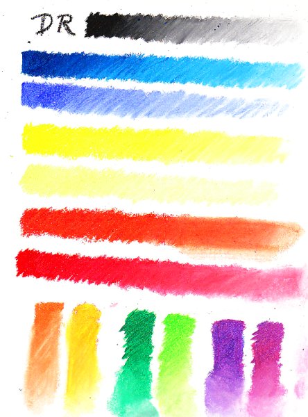
Temperature
Half of the primaries and secondaries are considered Warm colors: red, orange, yellow. The other half are considered Cool colors. Where the color wheel gets divided by a line varies with different color theory experts. Some color theory authors consider yellow-green to be a Warm and red-purple to be a Cool, or the reverse, but this only comes in when you start looking at local temperature. Among many variations, I choose to consider yellow the warmest and purple the coldest color for deciding which of a pair of warm and cool hues is the warm one. Experts in color theory disagree when it comes to blue, some sources call a purplish blue the cold one (as I do) and some the greenish blue. I lean toward the purple for emotional reasons -- blue green reminds me of warm tropical seas and blue-purple reminds me more of shadows on snow. Blue is cold when it's compared with other colors, no doubt about that. But there's an improtant difference between a purplish blue and a greenish blue if you're going to mix it with, say, green. When you want brights, choose the version of the next color on the wheel that's the closest to it. The term in color theory is Local Temperature when a color's only compared to itself. Lemon Yellow is universally considered the Cold Yellow, leaning toward blue. Warm yellows are described as "buttery" and have a slight orange cast. Pure yellow that doesn't lean either way is rare, but it tends to be lumped in with the cold yellow because so many yellows are orangy. If you want bright orange, choose the warm orangy yellow and the warm orangy red. It'll blend great and you'll have a strong bright orange. It's possibly one of the easiest colors to mix. Let's look at the two tough ones -- the ones that take blue to mix them. Color theory crashes on real pigments almost every time with green and purple. It took me years to get a good mixed green or purple in any medium. There's a color theory book titled "Yellow and Blue Do Not Make Green," catchy because it's true. Usually they make a brownish murky olive and never get as bright as a summer day in New Orleans right after the rain when the leaves are washed clean. This is because even the slightest amount of red in the yellow leaning it toward orange or the slightest red in the blue leaning it to purple will brown it out to olive. I didn't like mixed greens for most of my life until I discovered what happens with Lemon Yellow and Turquoise. Try that combination -- it's good and bright. But color theory never says "Lemon and Turquoise Make Green." The old stock saying from kindergarten is "yellow and blue make green." Clean bright purples do not often appear when you mix red and blue either. What comes up is often a murky slightly purplish gray, sometimes depending on how orangy the red is and how greenish the blue is you can get a pure, perfect gray. This is great if you're mixing a dark red and a dark blue to get a livelier black than comes in your set. Not so great when you wanted bright purple. A cool purplish red, or best of all a bright cool purplish red like bright magenta or pink will mix with even a slightly purplish blue to make a great violet. Try a pink highlighter and a blue one. Wow, the purple is good. This is the basis for why printers' ink primaries being Magenta, Cyan and Yellow. Cyan is a very slightly greenish cast blue, but Magenta has so much blue to it that it overpowers it and some Cyan is very close to the pure primary hue. So the color theory idea of Temperature of a color is both something in general for what hue (which color) it is, and also how warm or cool it is relative to other pigments that are the same color. Local Temperature is what's relative to itself. Orange is cooler if it moves toward red, warmer if it moves toward yellow. Green is warmer if it moves toward yellow even if it is a cool color. So the relative temperature is something different from the hue temperature. This helps a lot in sorting your colors. Notice how smoothly each shading bar blends from dark versions of the red or the blue to the light tints. I used a pink on the cold red bar before I added white, and that made a smooth transition. On the warm (greenish) blue bar, I had three different blues from Indigo to two tints of Pthalo Blue before I mixed in white. When you're mixing oil pastels or soft pastels, it helps to organize them by hue and then by tint. Many artists like to take all the muted colors out of their hue category and put them together in their own category, so that when you need a reddish brown, an olive green or a gray-blue you can find it easily among the neutrals and muted colors. That's how I like to arrange them. Another trick for oil pastelists, who sometimes wind up having hundreds of sticks in different brands, is to organize each basic hue by value. Value is how light or dark it is. My shading bands have strong value ranges except for yellow, which has a very short value range. The longest value range is usually blue or violet, though sometimes green and red can have very long ranges because manufacturers include shades. Tints are a pigment with white added to make it lighter, like the four successive tints in one of the little five-color boxes in my Holbein set. Shades are the same pigment with a little or a lot of black added to darken it. Shades of yellow will usually turn into olive green, something useful to know if you're doing a monochrome painting and can only use one color with black and white. I used yellow on one in college as a cheat and wound up with essentially four colors -- yellows ranging up to white, greens ranging down to black. It's possible to get a decent landscape out of that arrangement. But if you want it to come off as if it's all shades of yellow, brown is a better darkener for yellow. I go to Yellow Ochre as the darkest and then keep going into yellowish browns. Up at the top of the next graphic is a shading bar I created to show a longer value range for an earth yellow (slightly muted, not as bright) going all the way to browns. When I try to do a yellow monochrome, going to brown is a lot better looking than going to olive and black. A good mid-brown will lean toward yellow and just get darker and darker. 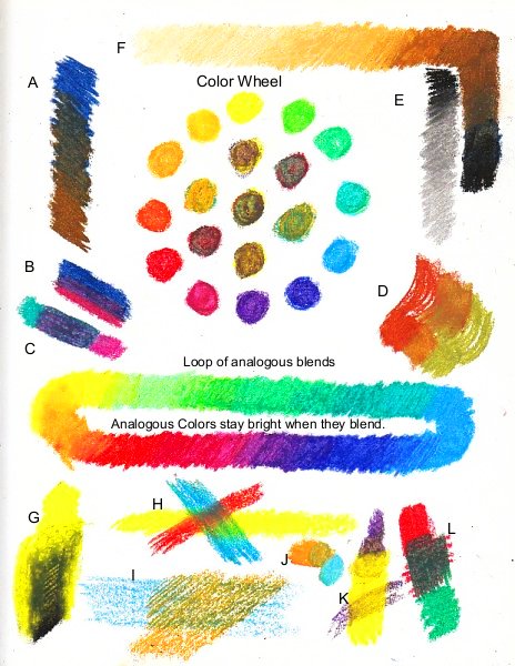
This is the color theory page I started before writing, with the color wheel on the top. I've put letters on each of my mixing experiments so that I can explain them in order. We already talked about how analogous mixtures stay bright and complementary mixtures become muted or even muddy. So let's look at this Making Marks page from my sketchbook in order, swatch by swatch. It's mostly about mixing and color theory. I did this one with my Gallery oil pastels. You can do things like this with any of them and I seriously encourage it. If you don't have many colors, try lots of mixtures for the ones you don't have. Personal mixing charts like this will do more than just help you remember color theory when you do them at home. It'll teach you how hard you have to press in order to grind the white into a light blue to get it to turn into the next shade lighter blue. It'll show exactly what happens with the unlabeled pigment of a Teal when you blend it with that Magenta -- probably gray, but you never know! So this one is also specifically my first mixing page for my Mungyo Gallery oil pastels. It's a personal reference that will help me a lot when I want to paint a sunflower, a tree or a purple iris with them. Color theory is at its most useful when it's applied. As long as you remember pigments are not always pure hues, it works fine. So don't just take color theory as a given, test it for yourself and see what your combinations give you. Every one of them is useful for something. Heck, you may want to paint a mud flat someday and that's when your "Mud" could be a rich combination of shifting, subtle hues close to the same value. A. Indigo and dark brown. This mixture is one of several possible recipes for either a darker brown or a more vibrant black. Depending on how dark your brown gets, you can get much richer blacks blending a mixture. It mysteriously seems darker. This never got mentioned in anything I read on color theory, but I was taught by a brilliant colored pencil artist in person who used Indigo and Sepia for all her blacks back in the 1980s. Later on an oil painting master showed me how Ultramarine and Alizarin Crimson make a gorgeous black. It didn't happen with these sticks, but something did. What I got with it this time was still valuable -- a shade of dark brown darker than the darkest stick in my Gallery set, still lighter than black. It turned into the color I usually use to create a mixed black. Indigo is a gorgeous darkener for greens too because it's a super deep green-cast blue. B. Indigo and my darkest red in this set. There is no equivalent of Prismacolor Tuscan Red in the Mungyo Gallery 48 color set, but sometimes other reds will combine with Indigo to make a good dark rich black or violet. Since it was a magenta, the result with Indigo is a fairly bright but deep violet, no darker than the Indigo itself. The green in the Indigo was overpowered. C. Deep blue-green with that magenta. This made nearly the same shade of dark violet, a bit more muted than the stick of dark violet in the set. Interesting if I want to tone that dark violet one way or another. If you have a small set, you may want to make a "plaid" page of color tests. I saw it in a color theory book -- a row of labeled vertical lines of each of your colors, crossed by horizontal lines of each of your colors. The plaid chart gives exactly the combinations of each hue including what happens if the yellow or the red is on top -- opaqueness can matter a lot to that. D. Two Complementary Neutrals. The top curvy bits are a patch of reddish brown like Burnt Sienna overlapping a patch of Olive Green, a muted green. In the middle they turn to a medium brown. I put the pure colors next to the unmixed patches alongside a patch of the medium brown stick. This mixture is unnecessary work since I have that color in a stick, unless I want it to have a variable texture. I could use it in a scumbled or crosshatched way to make it more exciting than using the brown stick. If I wanted something to shade into that brown I could go over it with both of those colors and send it going either direction. E. Pure grayscale shading bar. The set has two grays. Shading from black through the darkest gray and then the lightest gray will show me whether one of the grays is warm (brownish) and the other cold (bluish). Some sets do that with the grays. This one has two true neutral grays, though a little brown or blue mixed in would give me the warm and cool ones. F. Earth Yellow shaded down to Black. I had a pale earth yellow stick that looks like Naples Yellow, a good highlight for animal fur and many other things. I used that, yellow ochre, a darker gold and then went into the mid brown and deep brown. After the deep brown I added some Indigo for a small patch before shading black into it. That made a much smoother transition. If I want an area like say, a haystack, to have an overall impression of yellowness, I would use this range of colors for it. I might keep all the shadow areas very warm if I wanted it to look more golden -- or put violet into some shadows to make the Naples Yellow and Yellow Ochre look yellower. Colors next to their complements look more intense. They aren't, but they look that way. So if your color mixtures or the hues of your sticks aren't bright enough to suit you, try punching up a passage by putting in something that's the opposite color. A violet petal in front of part of a yellow daisy will probably become the center of attention by value contrast and complementary color contrast. G. Yellow shaded down with Black. The olive green effect wasn't as pronounced as with some yellows. It happens when the black is a little bluish, as most blacks are. This one is proved to be a true pure black, neither brownish nor bluish. There is a little of the "olive green" look but not so intense as with some blacks I've used. Try yellow and Paynes Grey for some great olive greens. H. Cyan, bright orangy red and yellow crossing each other. This one demonstrates pigment strength. Some colors overpower others, and it's not because of what color it is. It's because there's more pigment, or it's more opaque, or the pigment particles are finer (results in more pigment). The red pigment going over the yellow hardly changes. Technically it should turn orange, but the yellow isn't strong enough to lighten it and it's somewhat opaque. Where the warm light blue goes over the yellow, it turns bright green because it's a green-leaning blue. In the middle is a small area of pure perfectly mixed charcoal gray. I. Orange and Light Blue. Working loosely, I put some of what looked like a mid-orange over bright green-cast blue, the Pthalo Blue tint. The yellow in the blue and the strong yellow in the orange made a pretty good medium green, not as garish as the pure bright green. This would be a good combination in foliage, especially if it's just starting to turn in the fall and some bits of the orange show. J. Orange and Light Blue Blended. On the scan it barely shows, but I did heavy pressure mixing of both of those. On the real page the mixed green shows up stronger. Why it's a good idea not just to read these things but to try them with your own oil pastels and discover the exact colors you get in combination. K. Yellow and Violet. This complementary mixture resulted in a golden brown, the yellow is very strong and the violet is transparent. L. Red and Bright Green. Merry Yuletide! Let's see what we get when the icing melts: a deep nearly pure dark mixture that could go to charcoal gray with enough layers. Quite darker than either of its elements, this combination comes closer to those mixed blacks I was talking about earlier. It's almost a perfect combination of primaries and secondaries -- a cool red with a little blue in it, and a bright green with a lot of yellow balance the primaries close to even. Technically all primary-and-complement mixes should make gray, but it's the proportions of the primaries that make different shades of brown or olive etc. Loop of Analogous Blends. I wanted to demonstrate how bright the mixtures are when you start blending colors with their analogous neighbors on the color wheel. Dots separated by a bit of white don't do it. So I started a shading bar with yellow green and kept running each color halfway under the next with a heavy application. Let's go over the terms one more time. Then get out your sketchbook and start mixing colors from your set. Try different types of marks, loose or heavily blended, try the same combination with each of the colors as the top one (it makes a big difference), try optical mixing like crosshatching or dots next to each other. The best way to make color theory an unconscious awareness is to just play with your colors a lot, and try to match mixed colors you already have -- or create the ones you don't and make clear notes about what you used for the combination.
CMYK and Optical Mixing
CMYK means Cyan, Magenta, Yellow and K stands for blacK because for some reason printers didn't want to call it CMYB. A bit confusing, but that's printing tradition. Color mixing using CMY or CMYK includes adding black to the number of color separations. On your Sunday newspaper pages or most color comic books, you can look at it under a magnifier and see the individual dots that overlap or don't. Dot screens in all four colors of ink get overlaid and the result if they're lined up perfectly, is a printed example of miniature pointillism -- pure optical mixing at a level most painters don't bother with. Color theory and color mixing come together as long as you choose the correct primaries. Magenta is a cool red, leaning strong toward purple. Cyan is a mildly yellow-leaning blue, but Magenta is a much stronger color than the yellow. Thus the greens come out bright, the purples do come out purple, oranges are blazing spectacular and all the values are light to medium so you do need black in the color separations to achieve any dark tones. If you squint at the crosshatching and pointillist samples above of CMYK mixtures you can see the mixed secondaries created with these specialty primaries. If you can only get a few sticks, consider that combination -- but splitting your black into darkest blue and darkest brown may be better for painting than a pure black.
Terms for Color TheoryHue -- what color it is on the color wheel. The usual color names -- red, yellow, orange and so on. Pink is a tint of red. Peach is a tint of orange. Vermilion is a bright red-orange. Viridian is a bright bluish green -- and I finally memorized the difference between those two! Value -- how dark or light it is. Yellow has the shortest value range, by itself it never gets any darker than Yellow Ochre and that is stretching it. Violet seems to have the darkest range in most art mediums, sufficiently dark violet sometimes passes for black but looks better. Intensity -- how strong the color is or how muted. Olive green or gray-green have low intensity. Bright Green has a high intensity. Black, white and gray are zero intensity. Chroma -- Intensity. Hue Temperature -- is the color somewhere in the Red-Orange-Yellow warm group or the Green-Blue-Violet cold group? Local Temperature -- Whether the hue is warm or cold, is this version of it closer to violet or closer to yellow? Some versions of this consider green-blue the colder blue and put the coldest color as blue or green, the warmest at red or orange. I prefer the yellow-violet axis for warmer-cooler. Passage -- the area of a painting that is mostly the same color or thing. A flower petal or a group of flowers could be one passage, grouped by brightness or lightness to connect when you blur your eyes. The background area in general could be one if it's all done at once, or could be several if you paid attention to the clouds with one technique and did the sky between them in another. It's connected by being worked on all at once in more or less the same way. Primary Colors Red, yellow, blue, the hues that in color theory can be mixed to create any other color if they are pure. In practice, they are almost never pure. Secondary Colors Green, Orange, Violet, the hues that can be created by mixing just two primaries and none of the third in equal amounts in color theory. In practice, even a pure mid-red and a pure mid-blue are likely not to mix 50-50 to a perfect violet because one pigment may be stronger, more transparent or finer ground and push the mixture one way or the other. Tertiary Colors Combinations of one primary and a secondary, or mixtures with all three primaries in some proportion. All the other colors that there are. Opaque -- how completely a color will cover up what's under it. In oil pastels, opaqueness varies between very opaque with lights and darks both covering complements or lighter or darker colors, to translucent, some coverage, to transparent where it matters a lot which one's on top for the mix. Not actually a color theory term, but very important when theory meets reality and you have oil pastels in your hands. Color Theory ObservationsEntire books have been written on color theory. This article only goes into the basics. Read more articles online, talk to artists, and watch for updates as I may expand on color theory as time goes by. Color theory is the basis for the Colourist approach to painting, which is pretty advanced. I'm just getting into it now and not ready to do an article on it until I can do a good Colourist painting on my own without a teacher looking over my shoulder to critique. The general idea is that if you get the color right, the value will take care of itself. In oil pastels, you can't do a gray scale "grisaille" drawing with all the values right under your painting unless you seal off the ink wash or graphite shading so it won't mix with your bright colors. A Colourist approach and a strong background in color theory is a good way to build paintings that are bright where you want them and muted in the direction you want them. Have fun. Try it a lot in your sketchbook and you'll have a permanent record of exactly how your oil pastels respond to your pressure, your room temperature, your choice of subjects and your tastes. Test everything I've said about color theory for yourself, don't just take my word for it.
|
