|
Mixing Greens
What makes mixing greens tough?Mixing greens is probably the toughest challenge you'll face in landscape painting with oil pastels. Even when painting flowers, getting the natural colors of foliage is difficult. If you follow nature exactly when mixing greens, you may wind up with a solid wall of monochrome green in a landscape painting. Especially if you're working from a photo where distant trees, grass and nearby trees and shrubs get flattened out to a narrower color range, your painting can become flat and boring. Even if green is your favorite color, it can look bad in vast quantity and make it hard to tell the grass from the bushes from the trees except by
value.
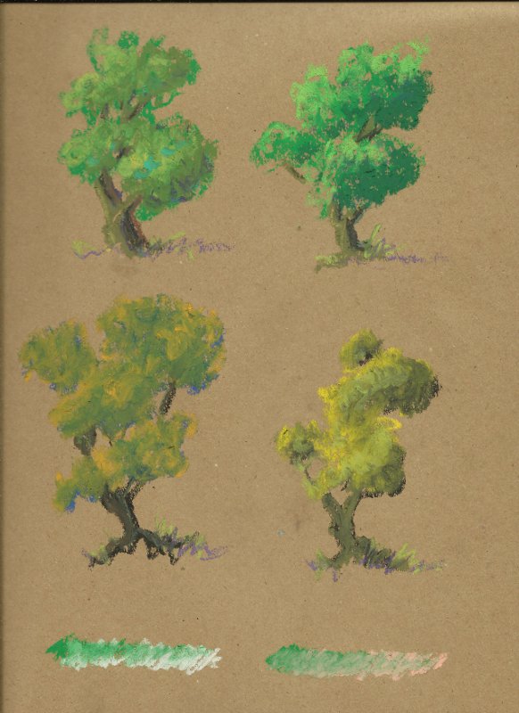
In the quick sketched example above, the tree at the upper right was done just with bright green pastels. They ranged from yellow-greens to bright blue-greens. Notice how monochrome it looks. You might as well have shaded up from the blue-green with a bright yellow to get the same result with two sticks. The upper left tree shows a little more variety. I muted the shadows in the foliage with violet and brought in a little yellow-orange in the highlights, while still working with the bright greens in between. This shading can work well in a high saturation landscape. Just don't duplicate it for every tree in the forest. One thing that makes a forest look natural is the subtle shifts in color between different trees. If they're all bright and fully saturated, none of them step forward and they still look a bit unreal. Let's look at the bottom two trees. The one on the left is almost entirely mixed greens done using a purplish blue and yellow-orange. These are colors you'd have even in a fairly small set of oil pastels, brights. Yet it's a lot less garish than either of the top two. A little red in the blue and a little red in the yellow together make the greens a lot more natural in the lower left tree. Where I did use green sticks in the combinations, I used the olive green and light olive in the set. Finally, the painter's great trick for olive greens worked great on the lower right tree. I used black sketched in lightly for the darks and then shaded over it mixing in a fairly bright yellow with a touch of orange to it. That combination makes a gorgeous olive green and can be used in any painting medium. A touch of the light olive stick into the mid-value areas completed it and pushed it a touch toward brighter green without being garish at all. Your combinations will vary. When you're mixing greens, it's important to develop charts of the different combinations your own sticks make. Each brand uses different proprietary pigment combinations and the binders can affect how pigments mix too. Below you can find a sample chart for mixing greens.

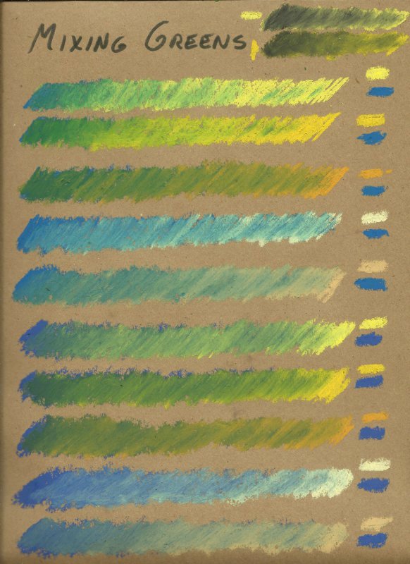
Charting Mixed GreensMixing greens from blue and yellow, black and yellow, blue and orange, blue and yellow ochre or cream will all give different results. So the best way to find out what your own favorite mixtures are is to use a paper that's similar in color to what you'll be painting on and create strip tests of the mixtures. On this page of Aquabee Bogus Recycled Rough Sketch paper, which is a nice mid-value brown, I've tested two different blues and five different variations on yellow or orange. The top five tests were done with a Green-Cast Blue on the color wheel, still blue but leaning toward green. Top to bottom I tried Lemon Yellow, Bright Yellow, bright Yellow-Orange, Cream and Yellow Ochre using the Mungyo Gallery Extra Soft full range set of 72. I don't need many mixed greens from that big set, but I love knowing how they'll behave. The bottom five tests (big bars) were done with Violet-Cast Blue and the same yellows. Again, Cream wasn't very strong at all and created a blue-green much closer to blue. It was a bit more muted on that one. This color might be good for pushing areas of trees into the distance, it's muted and bluish but would still read as green behind bands of other, nearer trees. Yellow Ochre didn't have quite the tinting strength on either blue as the bright yellows did. The most garish combinations were Lemon Yellow and Bright Yellow with the green-cast blue. However, that bright lemon green has its place in the mid-value band of foliage on a very bright green nearby shrub. Another big tip in planning landscapes - do not use the brightest green in both the grass and the trees. Choose one to be brighter than the other. Very often afternoon or morning sunlight slanting over the grass may make it look more like the orange-with-blue greens while the trees have more of the bright green in their accents. You don't need to use the brightest greens throughout your painting. It works much better to use the olive greens and muted greens in both your shadows and lighter highlights, then use the brightest greens in the mid-tone areas of a foliage mass. It will still read as green if there's orangy-green in the highlights and violet muting the shadows. What that does is make the sunlight look very strong and natural. Sunlight always has yellow in it. Early in the day and late in the afternoon, right after dawn and before sunset, it will actually lean toward orange. Dawn and sunset it may be more predominantly pink! So mix the light color with the colors you're using consistently and your painting will look a lot more natural. Don't be afraid to use broken color, scumbling, sgraffito and other texture techniques in creating foliage. One of the great things mixed greens will do for you is let you show bits of the colors you combine pure in the area. It'll look more like real leaves that way. If you think real leaves are actually that monochrome, take a good long look at them sometime. Sun on the shiny tops of leaves will turn very pale, almost white, minty-colored or light blue reflecting from sky light. Sun shining through a leaf from behind is what gives that brilliant acid green - but it's not in large areas, it's in part of one little leaf. When you do a macro painting, studying one plant and its flowers and leaves, you can relax and match the hues of nature. But it's always a good thing when mixing greens to exaggerate the subtle color shifts in reality so the painting pops out as looking more real. Just copying nature isn't always enough to help you see the likeness when you're standing across the room. So have fun mixing greens! Try every color in the box with the greens in the box, and try any combination that might mix to create a green. Your color range will expand so much beyond even a large set that you'll wonder how you got along without mixing greens! For more about
Mixing Greens
click the link to visit the Color Theory page or check out my
Color Mixing Video.
|


