|
Shading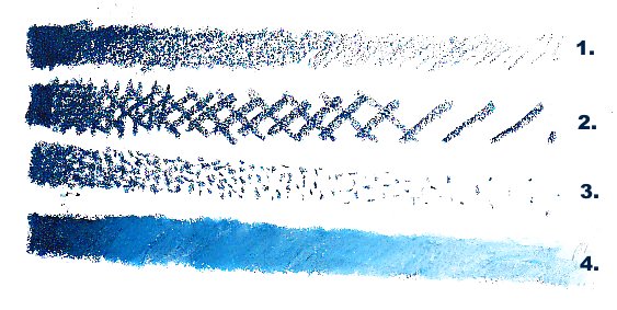
Shading one color in oil pastels can be done in four different basic ways. A fifth is to blend in successively lighter colors next to each other but we'll get to that later. I chose Erengi Art Aspirer oil pastels for this demonstration, using Indigo as the darkest color short of black. #1 is the most obvious -- lightening pressure with each stroke puts less color on the page. This may be the most common type of shading you'll see in any dry medium from colored pencils to graphite or soft pastels. It works well with oil pastels because they're soft. Heavy pressure will give full saturation to the darkest value of the color you're using. #2 is nearly as common. Hatching is what it's called when it's just one layer of lines to create a halftone (half the value of the full saturation color) or even a lighter color. Crosshatching creates darker values by adding three or more additional layers of hatching in different directions. This technique is most useful for pen and ink or other mediums you can't shade by pressure. It can create a beautiful texture with oil pastels and you can mix colors by doing the layers in different colors. Hatching is harder to achieve light values with, the only way to get them is to put the lines farther apart. Work a bit large if this is your favorite shading method, the more area covered with its variations the easier it is to get that texture. Your line width can't be wider than your details with crosshatching. #3 is popular for oil painting, pastels and pen and ink, it works beautifully in oil pastels. It also takes a long time compared to any of the others. Stippling creates gradual shading from very dark values all the way up to the near whites by how far apart the dots are placed. In dark values it may look like white dots against color, especially when done in pen and ink. If you combine different colors for optical mixing with stippling, you will create pointillism. Pointillism makes a beautiful all-over texture and vibrant color mixtures. It has a unique, dramatic look and it takes a long time to do because you need to fill in the little dots over the entire surface of the painting. Justly prized by collectors, stippling and pointillism are the shading techniques of patient artists. #4 goes back to something simple -- blending. I created a strip just like #1 and then worked backward from lightest to darkest with a white Erengi over the Indigo. The mixture exploded into brightness. The middle values are much more brilliant than the middle values in pressure shading alone. If you mix colors this way, it can look as if you had a stick of Light Indigo in your hand. This makes it one of the most popular ways to shade in oil pastels, since you can add still more layers to adjust the hue lighter or darker, greener or bluer, even mute it to gray, olive green or brown by adding complements in the right proportion. Value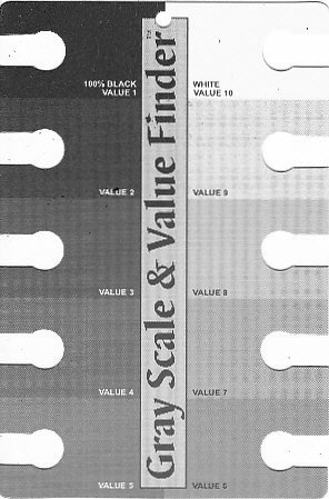
The above is a Gray Scale and Value Finder available at Dick Blick online for under $2. It's a handy widget printed on heavy card with a cutout on each of ten degrees of gray with white as Value 10 and black as Value 1. Some value scales run the opposite direction with white as Value 1 and black as Value 10 but I'm used to this one since I bought the widget. It's extremely handy for determining how light or dark a color is on a ten-degree scale. Put it over your source photo or hold it between you and the subject, look through the little holes and squint until you see the one that matches the value of what you're looking at. Using this can demonstrate some important surprises, like just how dark the shadows are on a white ceramic object. Most art teachers will have students create their own value scales in pencil. Try this. Try it several times -- and then use one of the printed value scales you'll find in books or order the widget to make it easier and more precise. Even experienced artists sometimes have trouble accurately creating perfect degrees of difference between each step of a value scale. It is much easier to do so when you have a printed one to compare your own swatches with. Also put a value scale over the full saturation patches on the color charts you make of your oil pastels. Jot down the number. That is the darkest value you can ever get with that color alone. Around the color wheel, value ranges are Short or Long. Yellow has the shortest value range. Violet, deep blue or green probably have the longest in your oil pastels. How you keep the sense of accurate color when shading a yellow object is by looking at what mixture with the yellow matches the way its shadows look. Same thing with white, pink or any light colored object -- the shadows may not just be darker blue on a powder blue teapot. They may become more violet or more gray, they may even look brownish, but if you get the color and value accurate the teapot will still "read" as light blue or yellow. Now let's look at some of these changes in action. Shape defined by Shading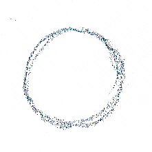
Here's a freehand sketch of a circle drawn with Indigo oil pastel on sketchbook paper, same page as the first illustration. It could be anything from a saucer viewed from above, a coin laying flat, a ball, a hoop. Without shading or any other shapes to give it context, it's just a circle. So let's turn it into something three dimensional.
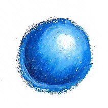
The simple circle pops out now as a three dimensional ball. I used different blue sticks to shade up from Indigo to white in between. Though I could have created all those values just with pressure and white I wanted to show how blended values look when you use colors very close to the colors next to them -- it can be gradual and smooth. I used two different blues and white but I have more blue values than that. The effects are richer. This little painting also shows the direction of the light by where the white spot and concentric lighter areas are on it. Darkest of all is the core shadow that curves like a crescent moon on the opposite side of the highlight. Under that, still in shadow, is a softer reflected light coming up from what it's sitting on. Between is a penumbra where the color is probably truest to the color of the ball. This one looks three dimensional and tells a lot more about what that circle was supposed to represent. But what if I'd shaded it differently?
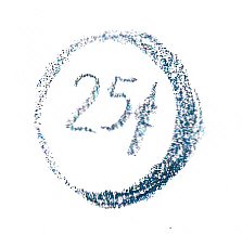
This quick sketch in Indigo just has a dramatic dark shadow coming around the side and gives the impression of a flat round object, a coin. I sketched 25 cents on the front just to make it more obvious, it's a cartoon quarter. If I took my time shading that slice of side showing, I could give it a lovely metallic effect.
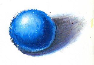
Shading is also how to create hard edges or soft edges. The ball itself in this example has hard edges, the line between what's ball and what's background is distinct and clear. I could have cleaned it up some, and probably would if I were to complete this painting by adding a background. The shadow shape also has a core shadow, lighter bands and a penumbra before it trails off into a blurry soft edge as many shadows do. How strong the light is has something to do with how hard-edged or soft-edged shadows are. On the surface of the ball and within the shadow, each value area has very soft edges following a curved shape that defines the shape of the object. Otherwise it would look "posterized" like a computer drawing where each value is a distinct hard-edged area. Real life doesn't look posterized, so soft edges are valuable to the artist. The best way to learn how to depict shapes by shading is to practice drawing simple geometric forms. Blocks, balls, cylinders and cones are shapes that can all be defined by shading. When you get into something more complex like the human form, you can get used to seeing the shapes of the shadows as what makes the form three dimensional -- and instead of thinking of it as a leg, think of it as a variable-width cylinder. Here are some examples of those basic shapes you can shade. More of this type of exercise will appear in Perspective where you'll discover how to place the lines that define the cube and make it three dimensional before it's even shaded and how to create the ovals that define the cylinder at top or bottom. These shapes are found in most still life objects and most other things if you get used to looking at them that way.
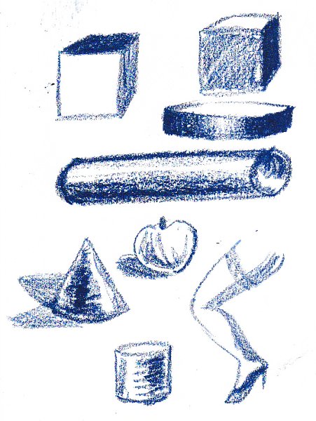
Practice shapes like this in monochrome or in color, it doesn't matter what colors you do them in. I added the lady's leg to be whimsical and to show how similar the shadow areas are to the cylinders and cones except that it's thinner and thicker in places. I could have rendered that in disconnected separate thinner or thicker cylinders or as a cone with the end cut off and a ball insnerted for the ankle, then another cone or flattened cylinder for her foot. Many artists do exactly that while blocking in figures -- come up with blocks, cylinders, cones and spheres for joints and limbs and torsos, then work over them and erase the parts that don't fit until they have the exact shape of the form. As exercises, these basic shapes are great. Notice how the light is coming from different directions on each object. Can you tell which side the strongest light is on? What angle the light is? With practice, you can. Take something cubic like six sided dice and put it on a white sheet of paper near a lamp. Put it on either side, turn it different ways, see how the different sides are different values. Look at a flattened cylinder like a ring or pillbox and see where it's shaded. Often on metal objects the shading is intense with very strong white highlights and reflections of dark objects right next to them, that's one secret of metallic effects. The reflections are distorted by the curve of the ring and lose their coherence as reflections, just becoming patches of light or dark color. Blue is a good monochrome color. It's always been a favorite of many artists. I came up with an idea about that a few years ago when I looked at a landscape by evening to see how blue evening light looks -- that's why blue paintings or monochromes make sense in the mind's eye. Twice a day everything in the world is in blue light. The actual values, colors, and shapes of things you draw probably won't be exact geometric forms unless you start out sensibly drawing your toddler's balls and blocks and maybe a funnel from the kitchen for your cone. But they are a great start to understanding how shading creates form and what the shapes of certain forms look like. My cone has a double shadow because the first shadow I put down was at the wrong angle to the light. I drew in the second shadow accurate to the highlight's placement and realized that I might as well demonstrate the double shadows most things have if you have two light sources at different angles. My room has two windows, one in front of me and one to the right. Thus any real still life object I set up may have two shadows at right angles. At night, the overhead light and my Daylight lamp create the same effect even more clearly. Look for lighting like that and see if you can get a double shadow on a simple object, then draw the shading exactly as you see it. If necessary just move a different lamp onto your table and set it at a different angle. This is a beginning of what shading can do for you in describing form. I think the study of shading is lifelong. So here is one of my last suggestions -- those first four bars on the top? Do them constantly as doodles. When you have a pencil in your hands, do any of them but especially pressure shading. With oil pastels try the pressure shading and color blending. When all you're doodling with is a pen, do shading bars in crosshatching and stippling. I have filled more phone pads with shading bars when I worked a 9-5 job than I care to think about, often going over notes that needed to be crossed out with them. The result is that I developed a good hand for pressure shading. Artists tend to have either a light hand, never pressing hard enough to get a strong mark but being very good at doing the lighter values, or a heavy hand good at full saturation but not as good at getting the light values. The more often you do shading bars and these other exercises as doodles, the more you will gain control of your hand pressure to be able to create exactly as much of a mark as you want to -- and no more. Try these with different brands of oil pastels too, especially once you get the super soft artist grade ones. I adjust my hand pressure to the brand of oil pastels very often because if I press as hard with Senneliers as for Erengi, I will smear them all over and have no control -- but if I go that light with Erengi, I may not make a strong mark. This is what sketchbooks, scrap paper and even random bits of paper bag are for -- a good lifelong practice that will make it so much easier to accurately depict something real that's in front of you before it moves and sticks its nose under its tail. My cat does that anytime I try life drawing. I bet yours does too and your dog's laughing. If you draw from real cylinders or balls, balance them so that they don't roll and try them with different angles of light. Enjoy!
|


