


|
Holbein Mixing
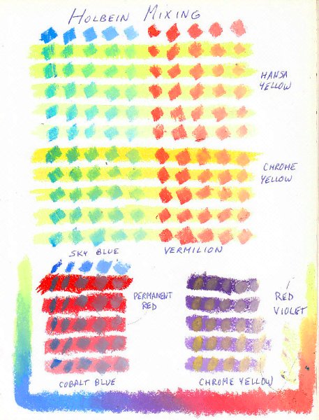
Holbein's palette is a Colourist painter's delight. In this mixing chart I tested primaries and one combination of primary and secondary colors, all brights from the top tray because a Colourist palette will mix neutrals from bright hues instead of relying on earth tones and neutral pigments. I used both yellows, a warm (yellowish) red with yellow, a cool (purplish) red with blue, two blues, and the red-violet that looks more like a balanced violet to me with its complement. Some Holbein pigments are stronger than others. Vermilion clearly dominates the yellows, especially the Hansa Yellow. Sky blue and both yellows produced very bright blue-greens and greens. Some of these aren't as blue as they appear on the scan. Permanent Red and Cobalt Blue made some clean purples, especially in the tints. One thing I noticed was that the tints blended more easily than the masstone pigments. This will be a good thing in clouds and light areas of paintings where I may mix complements or analogous tints to get a subtle shimmering effect instead of using grays. Chrome Yellow over Red-Violet had a much more powerful effect than it did under the Sky Blue, all of the patches mixed well to a good neutral brown. Interestingly, where I put a loose application of the red-violet and scrubbed hard with Chrome Yellow tint, it mixed beautifully. The key to mixing Holbeins is to test the mixture you want and be sure the stronger color is underneath the lighter or weaker. Yellows are not so strong that they tint as much coming up as going down, but the red and blue were more even in their covering power. Last, it's spectacular to mix Holbeins with the next hue in a chromatic order all on the same tint level. The U-shaped rainbow bend under the other charts is Tint #3 of all the colors in the top tray, blending Hansa Yellow over Sky Blue at the left and proceeding through the rest to Chrome Yellow over Antique Orange in the right. Some streaks where I cleaned off the Chrome Yellow stick of Red-Violet residue are next to that. Many of the same traditional and toxic pigments like Cadmium and Cobalt are included, but each color in its range had four staged tints with successively more white added. This makes it easier to match value when you're color mixing. Holbein didn't create shades by mixing black with the pure masstones, leaving that to the artist. Sometimes dark colors mixed with analogous dark colors are richer and brighter than shades mixed with black. Or you want the shade to lean one way or the other. Mixing a red with some violet gives one kind of maroon. Mixing it with brown gives another.
While Holbein's range includes a good variety of earth tones, it would be very easy to put together a Colourist palette that left out almost all of them. You can mix all your neutral colors from bright hues. I studied the Colourist method in a soft pastels class and my teacher studied with Susan Sarbach, who explains it in depth in Capturing Radiant Light and Colour in Oils and Pastels. This may be a good book for your library because in some ways oil pastels behave like oils for color mixing, in others they behave like pastels. You can mix colors evenly on a palette to achieve a smooth blend that's a new color, or you can go over them loosely with opaque color for optical color mixing. Taking a class in soft pastels helped me apply this advanced color theory well in creating Apples in Blue Silk and I know that I deliberately kept that painting at high intensity. I could apply the Colourist mixing principles easily enough with a triad of earth tones -- Paynes Grey for blue, Burnt Sienna for red and Yellow Ochre for yellow. I'd get the same color harmony in a more muted, earthy painting. If you can make your colors work together in brights, you can easily make them work well in neutrals and muted colors. I'll be doing more color mixing charts to expand this page later, possibly including stages of complex mixtures to demonstrate layering opaque oil pastels for shimmering, lively neutrals and shifting bright hues. I know when I do a landscape in Holbeins I'll definitely want to put an excerpt of some clouds on this page to show how a range of high key high intensity tints can liven up cloud rendering.
|
