


|
Art Lesson -- Fish and Coral DemonstrationThis online art lesson will show you how to create your own version of my Fish and Coral miniature to any size you like. The project includes underpainting with watercolor pencil, layering, wet effects with oil pastels and sgraffito. You can scale it to any size from an art trading card on up to a mural design. You have my permission to copy this painting by hand or create derivative works from it as long as you credit me for the design and link back to this art lesson where possible. 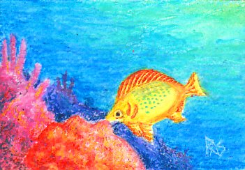
Fish and Coral by Robert A. Sloan, the project for this art lesson.
Materials NeededWatercolor paper- Cold press (medium) or smooth hot press, Rough is too rough unless you work very large. 90lb is all right, but 140lb is better, the heavier it is the flatter it'll dry without cockling. Erasable colored pencils for outlines:- red for foreground coral- pink or red for middle coral- purple for background coral- yellow-orange for the fish Watersoluble colored pencils - You can use these for the lines if tracing and not worried about errors. Pointed round sable or synthetic watercolor brush- Make sure that it has a good point to do the small dots. Use a larger one for big areas and a small one for details if the large one doesn't have a fine enough point. You can use a water-handle brush for convenience. Water cup with water unless you use a water handle brush. Cretacolor Aqua Stic watersoluble oil pastels - 10 color set has enough colors if you carefully mix your purple with Madder Carmine and the blues. 20 color set has Violet, which helps a lot, and larger sets allow more variations. A pointed metal or plastic scraper such as the end of a nail file, one tine of a fork, or anything sturdy and pointed. I used the nail cleaning blade on my nail clippers. A toothpick may be too blunt, unless it's plastic. A needle or pin is probably too sharp unless you handle it carefully and don't tear up the paper with the point. Now that you've lined up all the supplies you need for this art lesson, here's the line drawing for the project:
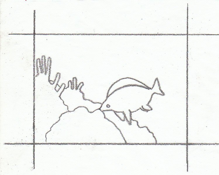
Outline drawing for Fish and Coral art lesson. The original size of my Fish and Coral painting is an ACEO (Art Cards Editions and Originals), a delicate miniature exactly the size of a trading card such as a baseball card or Magic card. I traced the line drawing and scanned it larger so that you can work bigger if you want. If you want to work much bigger, you may want to print out the line drawing, grid it and copy the lines on a larger scale -- you could even paint this 2 1/2 feet by 3 1/2 feet for part of a mural if you like. The larger you work, the easier it'll be to get fine details but the longer it will take to finish each stage of this lesson. You can also try copying the line drawing by hand instead of tracing from a printout, or alter the arrangement of the parts to fit a different shaped picture. Feel free to add more fish or corals if you'le filling up a wider area. Flip it backwards if you want. Just keep the corals at the bottom and sides, the fish can go anywhere in the composition. It's your art, your reef can have anything you like in it. Just because an art lesson hands you a canned composition doesn't mean yours won't come out well if you rearrange the elements. Some composition points to remember though: warm colors (red, orange, yellow) push forward and cool colors (purple, blue, green) push back to give depth. Underwater, the lightest area may be greenish or aqua while shadows lean toward purple and the color shifts are very dramatic. A small green fish with purple markings in the back could look like the yellow fish with red in the foreground and look right. These color shifts are sometimes called Atmospheric Perspective or Aerial Perspective, because they happen on land too -- distant mountains will look purple and colors truest in the foreground in sunlight.
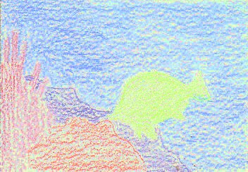
Using any brand of watercolor pencils, fill in each of the outlined areas with a light tonal layer. It's okay to scribble, but try not to leave huge white areas or heavy lines. Don't press hard. Lightly rubbing the pencil tip on the surface in small zigzag or circular strokes is best, any indentations in the paper might not accept the oil pastel and come up white or light in the final version. Cover the foreground coral with red, the middle coral with magenta or deep pink, the background coral in violet. Then color the fish lightly in bright yellow. Fill in the water with blue or light blue. Try to go a bit lighter in the upper right corner and shade darker as you get toward the edge of the violet coral, working around the fish in bands of color. If you have a large set of watercolor pencils, start this shaded water area with aqua, then sky blue, then one or two deeper blues till you get to a medium bright blue. I used four of my Aqua Monoliths to shade the water and overlapped the color bands in order to get a smooth transition. If you don't have watersoluble colored pencils for this part of the art lesson, then you can substitute any colored pencils as long as you substitute rubber cement thinner, paint thinner, odorless turpentine or other solvents that work with colored pencils. Bestine rubber cement thinner worked best for me with normal colored pencils whether cheap or artist grade. This is how it should look when you're done with this stage:
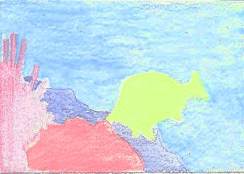
First Wash Now that your dry underpainting is complete, it's time to continue the art lesson with the next stage: a first water wash that will fill in all the white flecks and establish your color areas. Wet your brush thoroughly or squeeze water into the hairs from the reservoir if you're using a water handle brush. Tap it lightly on scrap paper or a paper towel, so that it's wet but not dripping. Start from the background in the upper right corner where it's lightest, using small side to side horizontal strokes to push the color ahead of you toward the bottom left and the line of the violet coral. Work around the fish carefully. You will probably discover fast that you can push blobs of color around to keep it smoother. This is a good trick for smooth underpainting, and that helps a lot with later layers. Going light to dark within an area ensures you don't get dark color streaking into the light areas. Now if you want to be careful, let the background dry. Just set it aside and do something else. You can wash in the red coral in the foreground without touching any of the wet areas in the blue water, so you won't get any blurring or bleeding between color areas. Leave those two areas to dry completely and work on another drawing, read, surf online or whatever. Watercolor painting involves a few minutes of painting punctuated by a lot of watching paint dry. It can be fun to start several paintings all at the same time and go back to the first one after you finish some more underpaintings. So experiment with other watercolor or oil pastel pieces and come back when this underpainting is dry and totally flat. I think this is mentioned in most art lessons involving watercolor. If it's cockled and didn't dry flat, there are things you can do to flatten it after you're done with the underpainting. Wet your brush again and blot it. Very carefully wash the color in the fish, working from the center outward. Try not to go over the lines into the blue area or you'll give the fish a green halo. I use a magnifier sometimes when I'm doing an art card with fine hard lines like this, it can help. Now let that dry a little and move to the magenta coral. That isn't touching the fish at all, so you can wash it on the same pass that you did the fish. Be careful running the point of your brush up into or around those little background sponges, but that isn't quite as important as accuracy around the fish because the colors are closer and easier to fudge. If you mix some purple there, you can always raise the line of the violet coral behind them. Let that dry and then carefully wash over the violet coral without slopping into the fish, the other corals or the water. You're done with this stage of our art lesson. Your painting should look something like this:
Don't worry if yours is darker over all, my scan is light. First Oil Pastel Layer This part of the art lesson begins the dry work. Because there's a good underpainting with flat color under each of the areas, I don't need to use as heavy an application as I would otherwise to cover the white paper completely. Any specks that show up are in a related color and much less noticeable. I shaded the background similar to the underpainting, with aqua in the upper right corner working down through various light blues to a medium bright blue. If all you have is light blue and darker blue, use light blue first, put a little white over it in the very corner, shade over it lightly with the darker blue and keep the mixture going to the edge of the violet coral. The dark blue in the ten color set is too dark by itself, so a fifty-fifty mixture is what to go for in shading. I used yellow on the fish and then shaded it with golden orange and orange, you can just shade lightly with orange if you're using the small set. I shaded the red coral with deeper red and some pink in the light area, if you're using the small set, go with white over the lightest area and Carmine Madder over the shadows. The middle coral is shaded between magenta and violet with some deeper magenta shadowing. With a small palette, you'll be mixing the violets and magenta colors so test them out on a scrap before using them on the piece. Be sure to wash your tests and compare them to the next stage too before applying them to your painting. I used a little white over the deep violet in the violet coral to lighten it. Whatever your palette is, experiment with combining colors and shading them. Give some depth and modeling to the forms at this stage. Going heavily over a previous color will mix them, sometimes you can see both and sometimes get a perfect mixture. Rub back and forth for a more blended mix as on the fish shading. It's okay to go heavy on the fish body. I added two strokes for the gills in golden orange, going lightly with the tip of the stick. You may have to sharpen your oil pastel to get lines that fine, but it's good. Notice I didn't add the eye yet. 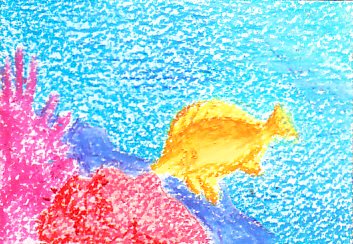
Second Wash Layer Wet your brush and make sure it's not over-sopping, this stage shouldn't get as much water as the first wash layer. The idea is to dissolve the color and push it around, not to create runs or blooms across areas. As we did in the earlier stage of this art lesson, work separately in different color areas that don't touch each other and rinse your brush thoroughly between colors. Let it dry completely when you're about to do an area that touches something you already washed. What's different this time is deliberate use of directional strokes to enhance your wet areas. Some of them will still be visible in the final painting. I used small circular strokes working outward from highlights in the corals, and pushed color out of the way when darker color obscured highlights. In the water, I deliberately kept all my strokes horizontal and pushed color back into any areas that lightened too much when I went over them. This took a while. On the fish, I kept my strokes curving smoothly from the nose of the fish toward the tail, widening in the middle. I went around the outlines smoothly and stopped clean at the end of the tail, but you can still see where a little mixing happened at the edge of the tail. This isn't irreversible, just try to minimize it. 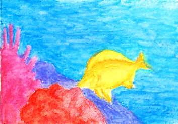
Finishing Details The last stage of my Fish Coral art lesson combines wet and dry techniques. You're almost done, but this part touches on everything we've done so far and a new technique, sgraffito. It may be a good idea to read back over the earlier portions of this art lesson before finishing and look close at the final piece. This is where we'll add the small details and unify the colors. I worked over everything dry, and started combining colors to unify the painting. I added some yellow, light green and yellow-green over the aqua in the upper right corner and shaded the green down into the blue water to brighten it and unify it with the yellow fish. I added some yellow and orange over the red coral in the front and a little orange to the magenta coral in the back, not much, just a few dots. This art lesson also includes a small area done in pointillism -- the final surface of the coral. I pressed down and dotted to add analogous colors, the ones right next to the main color on the color wheel: red-violet and orange on the red coral, red and violet on the magenta coral. I scribbled a bit but mostly did dots over each other to create a nubbly coral-like texture. This pointillism texture area will be kept dry. You can do some optical mixing here and even put in specks of violet or blue in the shadows. If they're too much, scrape them off. Complementary colors (opposites on the color wheel, like blue from orange) create neutrals when you stand back to look at it, they mute the colors but do so in a way that makes it zing. Create the markings on the fish by shading in the fin with red-orange, redder at the edge, and orange or red-orange on the tail and the front of the fins. Put a dot of red for the eye, as large as the outside ring. Put a smaller dot of black in the center of it. You now have a blobby, too-big, dark eye. Using either a very small brush or just the point of a very pointed watercolor round brush, wet it and drag it over the tip of your turquoise or light blue oil pastel. Practice dots on a piece of scrap till you get the thickness of the paint just right and the dots small and even. Dot in the markings on the body of the fish right over the yellow, making the dots larger as you go toward the top. Sgraffito I will be doing another art lesson on Sgraffito itself very soon, watch for it in the Techniques section of the site. Till then, the quick definition is that sgraffito involves putting a (usually lighter but occasionally darker) color on heavily, then covering it completely with another color or colors and scraping through with a pointed object to create lines, dots and details. Scrape lines across the upper part of the blue-green markings where on mine it blurred together, to separate those dots both vertically and horizontally. Scrape fine lines into the fins and tail. Scrape carefully around the pupil of the eye leaving a little darkish red around the outside and creating a yellow circle around the pupil. Scrape your initials into the water where I did, or put them over any part of the coral that's dark.
You're done! Be sure to link to this art lesson if you post your version of Fish and Coral online, and credit Robert A. Sloan for the design. If you want to create a mural or larger piece from this art lesson, I suggest practicing it at a larger size. You can work out a more complex design with fish cutouts on construction paper if you want to develop these techniques into a bigger reef painting. The larger you work, the more easy it'll be to create detail. Look at photos of other tropical fish and see how their outlines, colors and markings vary. Check out the other art lessons and demonstrations on this site for ideas. Using these techniques, you can either follow nature exactly or create whimsical fish in any colors you like -- and it'd probably take a tropical fish hobbyist or icthylologist to tell whether you made it up, the way I did mine. It's shaped like a common type of butterfly fish but the markings are a combination of several that I remember. Subscribe to my blog by the RSS feed to be notified of future free online art lessons in this series. I plan to do quite a few of them, each illustrating different techniques, brands, combinations and methods. Tips for Cockling If you've finished the entire art lesson and your painting is still cockled, lay out two or three layers of paper towels on a table. Gently mist the back of the paper with a plant mister, don't get it soaking but just dampen it. Press it on a towel and then press it onto the paper towels. Put a sheet of wax paper, printer paper or glassine over it. Then put a stack of heavy books on top and leave it to dry for a couple of days. When you take it out, it's as flat as it's going to get. Do not press it directly against the glass of a frame though, like any oil pastel it may be damaged by sticking to the glass. Instead, use spacers or a mat to keep the frame glass from touching the surface of your art. Decorative Painting Mural Version Adapt the design from this art lesson by laying out a sketch proportioned the same as the area of wall you want to put the mural in. Sketch the design from my line outline and then add outlines of other sea creatures such as anemones, turtles or octopi if you feel bold, clams and more sponges if you don't, and more fish close or in the distance. Then scale up your sketch using a grid, copy your outlines on the wall and use oil pastel for both the underpainting and later wet areas. Use wet effects even for the dry details in the final version. Then try a small oil pastel painting of your design before scaling up the outline to wall size for an acrylic version or latex wall paint. Use painted dots for the pointillist coral textures if it's for a mural painting. For another interesting and somewhat more challenging free online
art lesson
you may want to check out my second demonstration, Cretaceous Leaf Fossil. I painted a study of a Cretaceous leaf fossil in Holbein artist grade oil pastels on gray paper, documenting seven stages and developing it into a step by step record of my creative process as well as how to do blending, layering, establishing values, correcting mistakes and mixing colors with Holbeins.
|
