


|
Art Lesson: Cretaceous Leaf Demonstration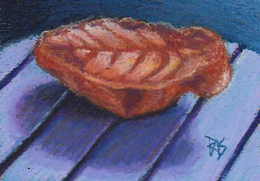
Cretaceous by Robert A. Sloan, example for my second oil pastels art lesson. 3 1/2" x 5 1/2" in Holbein oil pastels on gray Canson mi-Tientes paper .
About this Art LessonWelcome to my second free online art lesson, a step by step demonstration with Holbein artist grade oil pastels on Canson mi-Tientes pastel paper. Difficulty is moderate, if you are a beginner you can do this but will need to be careful. Read through it thoroughly from the beginning, then assemble your supplies and go through it again if you're new to art. When something doesn't come out right, try it again. It helps to do several versions of the sketch and early stages before tackling later stages on something like this. If you are already a skilled sketcher, some points in this art lesson may prove useful to fill gaps, especially if you're new to Holbein brand oil pastels. This is my own exploration of the brand, and some of the text was written right while I was drawing. It's a good habit to take notes on the stages of your work while painting or drawing. That will not only let you write up an art lesson later on, but it'll help you when you do another painting with the same materials or the same type of subject. These notes can even be scribbled into your sketchbook, it's something I started doing after seeing sketchbooks of some masters in museums. No matter how good you are, reading an art lesson can be fun. It may only remind you of some basics or get you laughing at me for my enthusiasm discovering something you've been doing for years. Have fun. Maybe it'll give you a cool idea anyway, and if you disagree with anything I've done -- try it your way. There is no one right way in art and there is no "obey the teacher" in a free online art lesson. Your worst results may be as valuable as your best because mistakes are serendipity. I discovered in writing this art lesson and drawing the rock just how easily Holbein darks cover over lights without blending them -- very useful knowledge that will free me to be careless about line and do fast loose painterly work! Everything is trial and error. You can't fail, that trial just shows you what happens when you do it that way. Enjoy!
Materials NeededGray Canson mi-Tientes heavy tinted art paper (or Ingres, Artagain and similar tinted art papers. Clipboard, drawing board or table. Size 2 Firm Colour Shaper Assorted Fingers Slightly soapy wet washcloth or Baby Wipes Gloves In A Bottle or other good barrier cream (recommended) Optional: InTus Holbein Deluxe Pastel Holder (from Jerry's Artarama). Holbein artist grade oil pastels with tints in: Yellow Oxide The numbering system is simple: 1 is the pure pigment (masstone color) and the higher the number, the lighter the tint. Old style sets have four tints: #2, 3, #4 and #5, but the #2 and #4 tints are discontinued. If you need to buy these in open stock you can get by with just the #3 and #5 tints by mixing them or adding white. If you just have the pure colors, make a mixing test on scrap paper using the color and White. Develop four successively lighter patches of color spaced about as far apart as the stages in my Holbein color chart on the Holbein review page. Remember how much white you rubbed into the color on each mixture or use the card to match it. You can do this to match the colors and tints with other brands too, if you're not using Holbeins. However, your results may not be as smooth if you are using firm hard oil pastels like Specialists or harder. Red-Violet looks a lot like a balanced violet to me. Oxide Yellow could be substituted with Yellow Ochre, and so on. Be aware that stiffer brands may be harder to blend and that a dark gray Clay Shaper may work better than the Firm gray one. Non-Color Two is medium to light grays, the colors used from Non-Color One are black and white. Difficulty: moderate. Create your sketchI've written a running description of everything I did but make the sketch. This is a rock. I drew from life, posing it on top of my semi-matte black external DVD-RW next to my laptop. I did create a contour sketch by eye, without using a photo reference. Then the sun went down and the light changed direction under my Daylight lamp. Thus, I don't have a photo reference to post in this art lesson or a tracing of my contour sketch. Study the finished painting. Use a pencil and do a contour sketch of its shapes. Remember, you can vary them. You could put the ridges on the background surface closer together or farther apart. You could put a different number of ribs on your leaf. So here's the first challenge in this somewhat advanced art lesson -- just the way you would copy one of the masters, copy my drawing by hand. Try more than once if you're not satisfied with your contour drawing. But don't worry about perfection as long as all the basic shapes are in and there's space to put the highlights and shadows in each area. Do this art lesson any size you like. Working large may be easier to get all the shapes in well. You do officially have my permission to copy my painting by hand and to post it online as long as you credit me and link to this lesson when you do. If that's too advanced, print out the image, blow it up and trace the outlines of the basic areas from the printout. Work large if you need to do that, you can grid it to enlarge it. Good practice with grid method, which makes any beginner look like a serious, accurate expert.
Stage One
This begins the part of the art lesson I wrote while I was painting. Here's my first notes right while I was scanning stage one: Darks roughed in on the stone with Venetian Red #1, on the background with Indigo #1. It's pretty simple at this stage. I shaded things a little but mostly just wanted to establish where the dark areas are and where the basic lines are. If you're good at sketching in oil pastels, you can just copy this and skip the Contour Drawing stage entirely. See? Now there's a good reason to read through the entire art lesson before doing it. You can save some effort if you do your sketch directly with the oil pastels. Scribble it a few times in your Making Marks sketchbook, try it in different colors if you want or at different sizes. This is the easy part once you're used to it, blocking in a flat dark area for shadows and darks, and drawing rough lines that might be refined later on with Sgraffito. At this point I considered going over those veins entirely with the lighter colors and scraping them out at the end to make very fine lines. Part of this art lesson is just to show my creative process -- ideas are constantly changing. You can plan and prepare, but the plan can change in a heartbeat if what you did looks better than what you planned to do.
Stage Two
More of my notes for this art lesson made while I was painting: Stone values developed with Venetian Red 1, 2, 3, 4, 5. Background toned grayer with Non-Color Two #2 in the darks and Non-Color Two #5 in the lights, also dragged across the shadow to form the highlights within shadow on the grooves. The lighter grays mixing with the Indigo kept it from turning into a bright lighter blue. When you want to tone down a color while blending and lightening it, you have two choices. One is to add its complement and the other is to add some gray. I didn't want to make this Indigo blue look greenish, it's already a greenish blue. Adding a light orange like Peach would have made a murky brown. But a clean gray will keep it blue and tone down how bright the color is without changing the color at all.
Stage Three
Deepest darks -- secondary shadow from side window across shadow, deepest darks on stone, touched with Non-Color One #1 (Black) for darkening. Here the light changed and I began mostly working from memory, turning on a Daylight lamp to see colors more true and using the shapes established during real daylight. I chose Indigo because its #1 pure tone is so dark it's nearly black. In most oil pastels, Indigo sticks may be the darkest blue. This can be very useful if you want something more vibrant than black, but need something to seem black or that dark. When you paint anything from life, either you need to work quickly or stop after an hour or hour and a half. The light will change constantly during the day. I wanted to finish this painting tonight, so I stopped looking at the stone for anything but shape and trusted that I'd drawn the highlights where they belonged. As the afternoon sun went down, the shadow lengthened and would have crept entirely out of the picture to the front. The highlights eventually went away completely when the sun was down and the only light is from my lamp on the side. This is why to get the values right early on if you're going to try this. On a more involved painting, I probably would have stopped and worked on something else, picking it up again a day later. A fairly simple pastel painting once took me three weeks because I needed sunshine between 1 and 2:30 pm to get it right. There were way too many overcast days to finish it fast, even though it only took four sessions.
Stage Four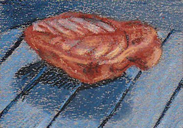
Indigo #5 touched into some highlights on the top of the stone for unity and to cool the light. Oxide Yellow #2 and #5 used to tone the rock and highlight it. Wash filthy hands as sticks are turning to mud. It helps to clean both your hands and your sticks often. If you leave smudges of Indigo on a light Venetian Red or Oxide Yellow stick, then when you go to use it you'll get murky streaks of green coming up in your next painting. I had to stop and clean myself up after changing every color, even though I used an Intus Holbein Deluxe Pastel Holder. Wipe the side of the stick after taking it out of the holder carefully, because it will probably carry a crumb or streak from the previous color. You can guess what my keyboard looked like after I was done with the rough draft of this art lesson.
Stage Five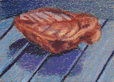
Indigo is a green-cast blue, and I decided the shadows and the surface of the background would look better with a purplish cast. Red-Purple #2 was an exact match for the main shadow area value, with #1 reserved to go over the black shadow areas and #5 into the lights within the shadow, which does make them a bit strong but that’s all right at this stage. It still isn’t blended. Some of these purples into the shadows on the stone help to unify it. From here on, all the colors I use in this art lesson will be touched into the other area somewhere to help connect things. Some Wet Wipes would not go amiss either, or a soapy washcloth. Up to this point I've been laying color over color very lightly. The mixtures are happening on the paper and there is some optical mixing. Some paintings and drawings look good kept this light, my previous stone studies did. Holbeins are very soft though, so I decided to blend everything in the next step and cover the paper completely.
Stage Six
We have value. We have color. We have little flecks of gray coming through it all over the place that make it look like a crayon drawing and they’re too uniformly spaced to be an interesting look fading into a gray background. Now it’s time to blend either with my dirty finger or a size 2 Firm Colour Shaper. Let’s try both and then try blending with the sticks, just working over the area with more layers of the same colors. The background behind the curve of the raised sections is smoothed with horizontal, very firm finger blending. I’m also marking in the crop marks again with a ballpoint so that I can see them when I scan. I want to be sure that I blend past all edges instead of leaving a small unfinished area within the picture. The entire rock got blended with the color shaper, this reduced the differences between the values and softened some edges I’ll crisp up again later. I did all the darks in the shadows next, the narrow strong shadows and the double shadow. Then the lighter part of the shadow, finally the highlight areas on the surface. On the lighter area of the foreground, I discovered I just didn’t have enough oil pastels on the surface so I blended with sticks. I repeated my colors of Indigo, Red-Violet and Non-Color Two and softened the edges of the shadow with the Red-Violet in the last layer. I scumbled a little Non-Color Two #3 across the right side of the far background. Then I touched up some lost highlights with Venetian Red #5 and scanned again. I wrote all of the above for this art lesson while I was painting. By this stage I was thinking about what I'd just done and recognizing how many discoveries I'd made about how Holbeins feel in my hand. I'd gotten used to their opacity. I wiped my hands on the soapy cloth without thinking and cleaned off the sticks while thinking of which one to use next. Some artists and crafters love to keep their tools in perfect order. I'm that sort, when everything is clean and ready to use, I am inspired. Others think best on a messy desk, unwrap every oil pastel that has a wrapper and break it in half, chuck them loosely into bowls or pastel trays and streak them on a scrap to find out what color they are before cleaning the end to apply it to their paintings. Develop the habits that bring out your creativity. Convenience is doing it your way. If there's another important message in this art lesson, it's to do it your way and use mine as information and a launching point.
Stage Seven
Final details and corrections are the last stage of any painting I do. Once the blending is accomplished and the basic forms are in place, the last part of any art lesson is refinement. Add more detail and continue to shift the colors till they are closer to what you see. For me that was bringing them closer to what I remembered. The most important point in this art lesson is not to fear mistakes. Mistakes are serendipity. They can give you new ideas, they demand that you work around them, they become challenges without risk. I mean that. What have you risked if you've completely messed up this art lesson? You put a gooey ugly mess on a piece of inexpensive pastel paper and you've got more of it to try again. You can set it aside and remember what combinations made the mess. You can carve into it with a scribing tool and try sgraffito, or go over it with another color and then try that. Or you can look at your mistake and fix it in a way I never thought of, inventing a new technique for yourself. Every mistake is an opportunity to stimulate your imagination, your creativity and inherent curiosity. It isn't going to blow up. Don't throw it in the fireplace, it might make stinky fumes with dangerous minerals in the smoke. Cobalt is dangerous if inhaled or ingested. So don't eat anything or smoke without washing your hands. One of the lovely things about oil pastel is that it's easy to fix mistakes. Just go over them and that usually does it. I lost the curve of the background on the right, so I restored it with Indigo #3. Then used all five degrees of Indigo to scumble over that portion of the background and shade it from left to right, cleaning up the upper edge of the rock as I did. I used Burnt Umber #1 into some of the darks on the rock to vary the hue and fix some proportions on it. The background is done now, but the rock needs more color variations and the fossil needs to be kept distinct in value and shape where it catches its highlights. Burnt Sienna 1, 3, 5 work to bridge the Venetian Red and the Umber, while some touches of Oxide Yellow 1 and 5 help define the rock’s details more. Highlights on the back of the rock with Cobalt Blue 5 help to cool the light on that side (the window side) and I return to Venetian Red to clean up any patches of color that look a bit off and restore the shape of the fossil. Dark shadows accented on the fossil with Red-Violet 1 and I sign it with Indigo 1 using a fresh sharp corner. I doubt my painting of this Cretaceous leaf in the old red sandstone will last 250 million years like the original, but it’s come out well and in good artist grade Holbein on decent Canson mi-Tientes paper, it may last for a while. For an easier free online Art Lesson my Fish and Coral Demonstration is fun. Do it the size I did for an Artist Trading Card or larger for a cheerful tropical reef postcard or painting of any size.
|
