


|
Thinner Wash

A thinner wash can produce the same beautiful wet effects with conventional oil pastels as water washes do for watersoluble oil pastels. This painting is done entirely in layers of wet effects on canvas paper, my original is 8" x 11" but you can scale yours to any size. Feel free to copy my traced image for this project, beginners are often challenged by the asymmetrical shapes involved in drawing a rose accurately. For this thinner wash painting project you'll need a set of oil pastels, preferably with 16 or more colors including at least two yellows, brown and yellow ochre or another gold color and several greens including a pale green, plus canvas board or canvas paper and a solvent used for oil painting to do the thinner wash. I used Gallery Mungyo oil pastels on Createur canvas paper for mine, you can use any brand of oil pastels you have for yours on any type of canvas surface. Canvas boards can be very convenient and inexpensive, so are canvas pads and canva-paper pads. Stretched canvas has a tricky problem for drawing, you can stretch the unsupported cloth to make it pucker by pressing too hard while drawing. So if you use a stretched canvas, cut a piece of thick cardboard to slip inside the canvas between the stretchers to keep it firmly supported. You can paint your rose any color you like, just choose several different values from very light down to medium-dark or very dark within the same color family. Or change hues as you go for a yellow and pink Peace rose, following the colors of a real rose. For white roses, shade with pale cool colors that reflect the surroundings -- pale grays, violets and blues reflect the sky, a little pale green would come in where the reflected green light shows on the yellow rose. For very deep dark red roses, you may want to use olive green over the red for the green reflections and go to black in the deepest darks. To begin with, I scribbled some Raw Sienna oil pastel on my canvas paper. I covered the entire surface with loose strokes without going heavily anywhere, then used an inch-wide flat brush to wash a lot of Gemini Masterpiece odorless turpentine substitute on it, dissolving all the color. You can use any brand of odorless mineral spirits, real turpentine if you can stand the smell, or products like Winsor & Newton Sansodor, Gamsol, Weber Turpenoid and other odorless thinners made for oil painting. Do not use Weber Turpenoid Natural citrus based thinner because that's not intended to be used as more than 25% of the paint volume, however, the British citrus thinner Zest-It is very good as an oil pastel thinner. I will be experimenting with Bestine rubber cement thinner too as that works well for this purpose with colored pencils and may be just as good for oil pastels. This toning layer is your first thinner wash. It can be used on heavy watercolor paper too. If you want to complete a dry style painting over it, this can give you a colored ground starting with white paper or canvas. Below is my toning layer with my pencil sketch barely visible on it.

Once your toning layer has dried, trace and transfer the lines from the tracing I made of this below. I drew this rose freehand on my toned canvas paper but found it was too hard to see for the demo. To transfer it, right click on the image of the tracing and save it to your computer. Print it out, then if you want to do it larger than the printout, use the Grid Method or a copy machine to scale it up to the size of canvas paper you're using. Then use a sheet of graphite color transfer paper under the tracing and draw over it with a stylus. Or just turn the printout upside down and draw with a soft pencil on the backs of all the lines, putting it against a window. Then trace over it from the front and you'll have it transferred to your surface.

If you want practice at freehand drawing, you can just copy the outlines by hand using oil based colored pencils. One of the good things about a thinner wash application of oil pastels is that it can easily be fixed -- a wet brush with more thinner can go over a mistake and then you can easily redo it. When it's a smooth wash, be sure to go over the edges of the patch area with other elements or there may be an overlapping "surf line." In the next image, I'll show how I began shading a yellow rose petal. Part of the problem with painting any yellow flower is that yellow has the shortest value range of any spectrum hue. The rose has darker shadows and accents than yellow can reach on its own. The solution is careful observation. A real yellow flower will have areas of green that reflect from leaves around it, and orange areas where the yellow reflects on itself in the middle of bright shadows. If it's pure yellow, it can go one step darker with gold and even from there into browns without losing that sense that the local color is yellow. So if you're following my colors, lay out a light yellow, bright yellow, golden yellow, orange, yellow ochre, orangy red, brown and yellow-green to start shading the petals. Then choose one petal at a time to shade in, following my examples.

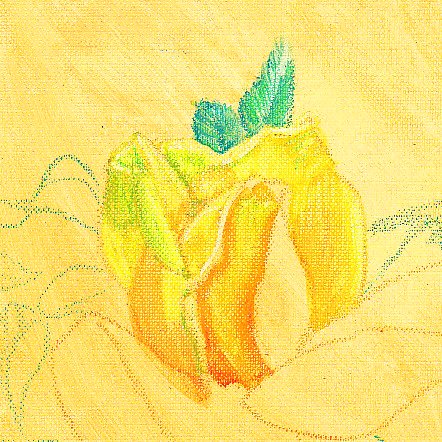
In the second image, I've done a thinner wash on the first petal I drew and put in several more, following the hue and value in the reference closely. Notice where petals go behind other petals they will darken, this is an important effect to observe and follow when painting any flower. I used a 1/4" bristle brush to do the washes on the individual petals, either turning it on the chisel edge or corner for tight spots or using the width over larger areas. You can use a synthetic or any sort of flat brush for this, just be sure to use the wash on one petal at a time. While it was drying on the first petal, I drew in the new petals. There is a reason to do one petal at a time. That helps keep crisp hard edges between your color areas when they are the separation between petals. When they're shading within a petal, wash them together with the same stroke so that they have a soft blurred edge that's more natural.

Continuing to add petals one at a time, I wash them separately after I do each one. Then I colored and painted a couple of small leaves at the top of the rose. On the leaves, I deliberately colored them with shading, then after the thinner wash drew in ribs with the light green so that they'd stand out like strong opaque brush strokes in oils. The surface of the finished areas resembles a loose oil painting.
Repeat the process of shading in each petal separately, then using a thinner wash on it. Avoid washing over an adjacent petal unless you have an artistic reason to soften that edge. I worked from one side to the other, doing the large petals on the outside last. Notice that at the base of the center there are some very dark accents. I used the orangy red and then muted it with dark brown at the very darkest points, going lightly with the orange-red because I wanted to keep the identity of the yellow local color. If you have changed the colors of the rose for your version of this project, test out the color combinations on an oval sample patch on scrap paper. Then do a thinner wash on your samples to see how they behave when mixed with the liquid. The following stage shows all the petals completed with a thinner wash and another leaf added on the side. 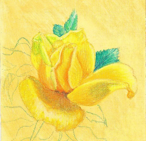
Another way to approach this thinner wash project is to use a waxed paper or plastic picnic plate as a palette. Scribble areas of all the colors you intend to use heavily on your temporary palette, paper or styrofoam works well, plastic may not have enough tooth if it's slick. Then load your brush with the thinner and stir it around in the color till you have it loaded with paint. Then paint as if you were using oils thinned to inklike consistency -- you will get a beautiful loose painting that way with distinct brushstrokes that may be lighter than this style of application. Again, if any areas are lighter and thinner than you want them, draw into it fast while it's wet with the chosen color. That gives a strong opaque stroke and keeps the painted texture. Here's the finished thinner wash painting again. Check the values and colors against this image if you're doing your rose in yellow. If you're using another color, then set out as many shades of that color that you have in order from the lightest to the darkest and try to use as many different values as you have. If you only have two or three, then shade an inbetween color by using a little of the darker one and going over it with the lighter to make a mixture. Thinner wash is a good technique for mixing unique colors. Look closely at where I have orangy shadows and greenish shadows. I took that directly from the photo reference and have seen it in many living yellow roses when they're surrounded by foliage. The surrounding colors reflect very strong into light colors like yellow or pink, sometimes creating a much darker value than you'd think. I had to use some olive green as well as green-yellow to get that strong reflection on the left, which I darkened in the final painting. For the background, I scribbled irregular patches of different greens and browns, overlapping them so that they'd shade into each other. I washed over this carefully with the small brush, keeping my strokes directional to give it a nice texture. If I had this to do over again, I would use more of the blue-greens in the background and the yellower olive and bright greens on the leaves. That's a reversal of aerial perspective and a flaw in this example. So when you do it, choose the more yellow-greens and olives for the leaves and put those blue-greens and bits of Prussian Blue and brown into the background, it'll make the leaves and flower come forward a bit more. Still, I like how this came out well enough to share it in an article and hope you'll enjoy trying a thinner wash technique -- it's a lot of fun and the result is an oil painting done with oil pastels!
|
