


|
Product Review -- Sennelier artist grade oil pastels
They are round wrapped sticks tapered at the end like colorful rifle bullets and are the softest artist grade oil pastel available today. Their texture is literally like painting with lipstick, and some of the colors are just as bold -- but don't use them on your skin. They include toxic Cadmium and Cobalt pigments favored by oil painters for centuries. Each stick that has toxic pigments is labeled clearly, so if you're painting around children or animals you can set those colors aside to just use the non toxic ones. Or if you order these in open stock you can choose only the non toxic colors. Edit as of 3/2012 - I just discovered one more cool thing about the wrappers. They're notched every quarter inch or so. It's very easy to peel back just a short strip of wrapper and keep the rest to tell what color it is that's getting short. Of course they also keep my hands clean. Some artists prefer to peel off the wrappers from all oil pastels to be able to use pieces on their sides. I like keeping my hands clean, so these Sennelier wrappers are a step better than the rest. They come off easily too, unlike the Neopastels or Erengi ones where I wind up getting a lot of pigment under my fingernails trying to get just a short strip off instead of unwrapping the whole thing. My first experience with Sennelier oil pastels was a sample sent by Dick Blick. Rather than just one stick, I got three primary colors in a little cardboard box with a thick foam pad and slotted foam pad. I tested that first triad for mixing. Below is a simple color wheel created with my sample primaries, all three are mixed in the center for an interesting neutral hue. 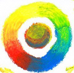
You can see that the Sennelier oil pastel sample primaries are good mixers. With a bit of work and a white stick, I could do an entire painting just using the sample sticks. It'd be limited in deep darks but it would come out true to hue around the spectrum. In person that sample wheel is a lot more gradual, my scan has some limitations on how well it shows yellow-greens and oranges at the same time even though I adjusted it in Gimp. Later on I developed this wheel further and created an abstract painting, using a black to build up the barrier circles and testing colors over their complements. 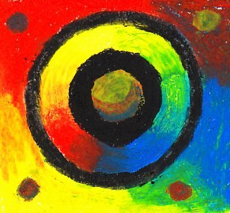
Soft, Creamy, Painterly and SurprisingUsing Sennelier oil pastels is an exploration. They don't have the firmness of other brands, so they're slippery and loose. Painterly effects are very easy even if that's not what you intended. They mix well on the paper and feel more like painting than other brands because of that softness. Not all Sennelier colors are opaque. There is a broad range of opacity and transparency in this brand, probably deliberate as it was developed for oil painters who are used to mixing and use opaque or transparent colors for different effects. Sometimes similar hues exist with different opacity or just different pigments. One good reason to use the real but toxic Cadmiums is that Cadmium colors are extremely opaque. This brand takes a little getting used to because the nature of the pigments creates more variation between sticks than exists in other brands. They are much more like using high quality oil paints -- very pigment-saturated and easy to spread over a large area. Using any other oil pastels over them just pushes them around. The up side of this is that if you're having trouble adding more layers to a painting done in anything else, Senneliers will go over it. Opaque colors will go over it well allowing sgraffito or covering changes. Transparent colors will lightly glaze and change what's under them, they're a good toning and glazing choice. You can use temperature to help control the super soft texture of Senneliers by putting your sticks in the freezer or refrigerator. Be sure to put them in a plastic bag so that you don't get condensation on them and transfer water to your painting surface. Because toxic artist pigments are used, you might think this medium is less safe than other oil pastels. The biggest problem with these pigments is not skin contact though, it's inhaling dust with cadmiums and other heavy metals. Reasonable cleanliness in handling and not ingesting anything with dirty fingers is good enough -- though I will not be using these around my young grandchildren at all. You can also work around this problem easily if you choose your Sennelier colors from open stock instead of buying sets, because the number of pigments with a warning label is relatively few. What you lose by that is some of the best opaque brights in the series. There is a reason artists favor the Cadmium yellows, oranges and reds and Cobalt blue, it's not just the color but the working quality and opacity of those traditional pigments. Senneliers have their special place in any mixed brand studio as the soft outermost layer oil pastels. They respond well to wet techniques and oil mediums. They take very little pressure to make a mark and blend well, they can even be mixed on a palette and applied with a palette knife like oil paints that stay forever open. Their soft stickiness may make them a good choice for monoprinting and other specialized techniques. 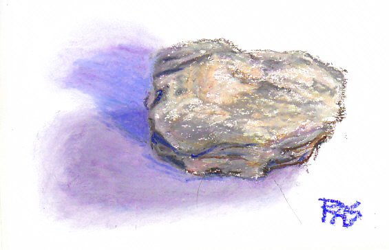
I purchased a 48 color Assorted set to have a larger range of them and noticed the palette is very different from most Assorted sets. It has more grays including subtle violet grays and yellow grays created for Picasso. It also has more similar hues crowding certain ranges on the color wheel because the company includes so many favorite painters' pigments. This is a rock study I did with my new larger set, demonstrating some uses for the unusual grays and muted colors Picasso loved so much. I chose this rock because it had those colors in it and I wanted to see how well they worked together in a painting. I also used some Iridescent White to give it a glittery look, and left some white speckles in the lighter areas as highlights where mica particles flashed in the light. I also finger smudged the edges of the double shadows, because they were softened when I looked at the shadow it cast on white paper. This brand is very good for finger smudging, it's easy to get a soft edge whether you want one or not. Getting a hard edge takes using a light hand and the point of a stick or a Colour Shaper to push it around. Many sets of dry mediums are arranged with a smooth chromatic range. Depending on the size of set, you get one each of primaries and secondaries, two each, three or more in a close range of hues expanding beyond tertiary colors like turquoise all the way to subtle hue changes that are very close in value. Look at any set of colored pencils for that type of range, or at the Neopastels lineup where the tints are grouped nicely away from the chromatic range in a big set. My 48 Senneliers aren't even arranged that way in the box. It's a good box very similar to the boxes they use for soft pastels -- sturdy cardboard box with a thick slotted foam holder and a thick foam pad over that. Printed color swatches and color numbers are marked on the side of the lid for easy replacement once you've worn them down to nubs or gotten rid of the wrappers. The idea of these pastels is to treat them in a painterly way, mix the hues you don't have from the pigments you're familiar with in painting mediums and learn the differences between pigments and mixtures that have very similar colors. No. 230 and No. 233 are very similar value skin tones, neutral tints with a reddish cast. One is slightly more reddish than the other but is not darker enough to use as a blush with the first one. They are so close I would probably not be using them together in the same portrait, but using either as a light tone within a portrait would give me a different complexion. Out of 48 colors there are six or seven grays, depending on whether you consider a muted reddish violet to be a gray or not. I love the Sennelier texture. Because they are so very soft though, it's likely these will wear down faster than more firm oil pastels. Happily, the company also makes Le Grande giant oil pastels in the full range of colors for those painters who like to work loose and large. I'd recommend getting a Le Grande white if nothing else because there isn't a gradated series of tints for the major hues in this brand the way there is for Holbein. I purchased an extra white, a Colorless Blender (medium without pigment, good for using opaque colors as transparencies) and an Iridescent White when I bought my set of 48. I love that Iridescent White. It blends with anything including other brands of oil pastels, lightens and gives a glorious mother-of-pearl look to anything I paint with it. One of my future paintings will be a vivid, realistic abalone shell as soon as I can get one for a still life object, where I'll tone up all the hues with Iridescent White to match the look of the shell precisely. I don't own any of the metallics, but the full range does have some good ones. The largest set is 120 and there's a 48 color "New Colors" set that may include hues not in the 120 color set, I'd have to print off the list of colors and check off duplicates to tell if that's included in the 120 color set. They used to make many more metallics and some fluorescents but these are apparently discontinued. Here's a color chart for my 48 color set plus the primaries that came in the sampler and my Iridescent White, which is on there: 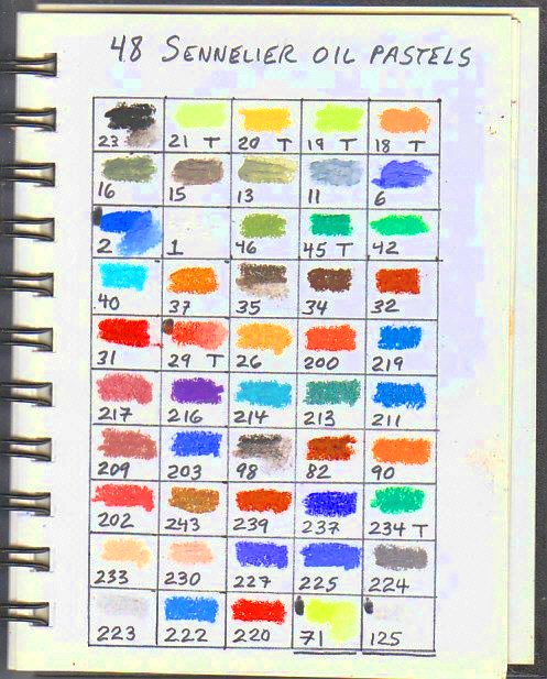
I will create a new Sennelier color chart when I add more colors or purchase a larger set. Watch out for the price per stick within a set versus the price for individual sticks in open stock. Sometimes the sets save money and your sticks are cheaper individually, other times you might get loaded with lots of colors you don't use often but pay more per stick to have something to keep them in. Blick has a bulk markdown if you buy three sticks at a time, and I think that has to do with the little three-stick boxes they mail them in -- so when I buy at Blick from open stock I like to get them in threes and keep those mailer boxes handy for storage. If you're interested in hearing the NPR radio program about the history of these oil pastels and a reporter's visit to the original shop, the link is below. I enjoyed it.
"Art and History Intersect at a Paris Shop" NPR radio program
|
