|
Product Review -- Reeves Oil Pastels
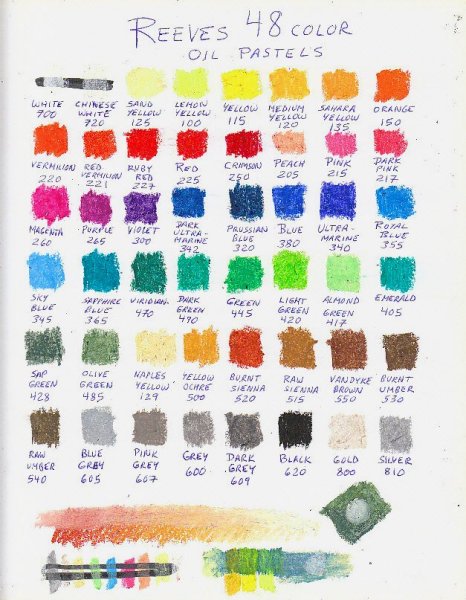
Cougar Study by Robert A. Sloan. Reeves oil pastels are soft, large wrapped sticks -- not as gigantic as the Prang but certainly about the size of Neopastels or Senneliers. I tested the 48 color set of Large oil pastels trusting the 24 color range Hexagonal Oil Pastels were their equivalent of Crayola oil pastels -- bright range suited to younger children. Reeves is a British company owned by Winsor & Newton. They have very high standards, most products are nontoxic, safe for children but created for high school students, art students on a tight budget and adult hobbyists just testing mediums. They make quite a few starter art sets in various mediums. It comes as no surprise then to discover that while Reeves doesn't have high pigment composition in this product, they did try to match the texture of medium soft artist grade pastels. These are more crumbling and beware the crumbs -- like the crumbs on Neopastel, sweeping your hand over them will blend them into nonmatching areas. Blow on your art or very carefully remove crumbs with a Colour Shaper or blend them down into their color areas. The palette includes many earth tones important to the nature and animal artists such as Naples Yellow, Yellow Ochre, Raw Umber, Burnt Sienna. These may be nontoxic hues but they're good matches if they're not the actual earth tone pigments -- most earth tones are nontoxic anyway and usually the least expensive pigments in oils or watercolors. Opacity isn't that great. It wasn't in Reeves acrylics or oils either, how they manage to keep the cost down is relatively low pigment concentration or more coarsely ground pigments allowing them to market art supplies at a very low price. This set was $7.41 at Dick Blick when I ordered on January 31, 2009. Being softer and less opaque, I had a bit less control with them than I got with the Pentel or some of the other brands. Sgraffito worked fine, the dark colors went over white without too much change so I was able to spread large areas of white under the whiskers and ear tufts, then scratch them out clean with a blunt yet pointed nail cleaning blade. Reeves may prove to be a decent choice for artists on a budget looking for sketchbook use, studies, illustration and so on. The soft texture and transparency will help a student overcome some of the inherent looseness and varying opacity in Senneliers and the palette is well chosen for fine art. They're not the easiest student grade to use but if you're purchasing several cheap sets to learn before upgrading to artist grade, by all means pick up one of the Reeves sets to get used to the softer textures. They are not quite as soft as Sennelier but softer than Neopastel, so they are good practice in handling soft oil pastels. Note that the White is a good deal more opaque than Chinese White. The whites are slightly yellowish compared to the bright white paper I was using. Having a lightener with less opacity may help depending on the degree of lightening you want. Chinese White may make a better blender with less change to the native hue. I used Naples Yellow over Sap Green and Olive Green in the background. I blended most of the earth tones and grays into the face and markings on the cat and his eyes are also in Sap Green and Olive Green but shadowed and darker. Some color names are a bit surprising. Get used to British spelling on the greys and everything else about the set. Sapphire Blue is actually a turquoise, almost a turquoise green. Royal Blue is a light green resembling a color called Kings Blue in some artist grade sets, not the deep ultramarine we're used to seeing in the USA under that name. Viridian is darker than I've come to expect. Overall, this set is a good bargain and poses some challenges in handling soft texture sticks for a new artist. Used in conjunction with a more firm brand it could allow some of the hard-and-soft layering tricks that work better than both. At this price, they're not that expensive an investment. Packaging on the Reeves 48 color set is a thin cardboard box with hanger and top flaps, inside is a cardboard tray with styrene inserts. One important note -- these are one of the inexpensive brands that claims good lightfastness. Here's a quote from the English language description on the back of the box: Reeves Oil Pastels are made with high quality pigments. Perfect for colour mixing they can be used on a number of different surfaces. Reeves Oil Pastels offer * Vibrant strong colours * Good lightfastness * Soft and easy to apply * Easily blended. All of the above is true as I tested them, except the good lightfastness claim. If the use of artist pigments with known good lightfastness in lower quantity does make these stand up to my lightfastness tests, Reeves could turn out to be a serious bargain to the street artist. You may have to handle them a bit differently for texture and opacity but if they're lightfast there's no reason not to use them on good supports and sell the resulting artwork. Below is a color chart, colour chart as Reeves would put it. You can see that this is a fine artist's mixing palette. It includes warm and cold primaries and secondaries, nearly a full row of earth tones and neutrals, and tints in several important hues. A good general palette and an excellent one for teaching color theory as it relates to painting. 
Some blending tests on the bottom of the color chart show several different combinations. Olive Green and Sap Green looked very similar so I blended those at a diagonal across a square, then added a dot of white over them to see how much it'd lighten them. The long warm toned bar has Burnt Sienna with Yellow Ochre overlaid for a while and then Naples Yellow over that. The upper half of it is blended together with White. Off to the right of that, a loose application of Prussian Blue is overlaid and blended with Naples Yellow and several other yellows to see some of the resulting mixed greens. This is a painter's palette and I have no doubt they're using the same hues they do in student grade oils and acrylics. How well they interact with the binder is one of the things I'll be finding out in lightfastness testing.
|


