|
Pink Petunia Project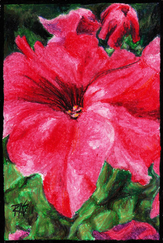
Introduction and MaterialsThe Pink Petunia Project requires white drawing paper, an HB pencil, a set of student grade oil pastels and white drawing paper. I used my 36 color set of Faber-Castell oil pastels and an 8 1/2" x 11" hardbound sketchbook that a friend gave me as a birthday present. Any brand of pastels or sketchbook paper will do, but the more colors you have available, the better. I used two shades of pink, white, red, orange, magenta, deep purple, lavender, dark blue, bright green, olive green, dark brown, yellow ochre, yellow and light yellow. If you don't have any of these specific colors, you can mix colors to create tertiary hues like olive green or yellow ochre. Paint from your own photo if you have these flowers in your garden. Go outside with a digital camera, set it to close-up and snap close-up photos on a sunny day. Or you can work by copying my painting step by step. This project shares a method to paint any garden flower from a macro or close-up photo, or you can sketch outdoors from your own pink petunia. Whether you use your own reference or my sketch, several important painting methods are used in this project. My proportions are 6" x 9" but you can work larger or smaller depending on the size of your sketchbook. 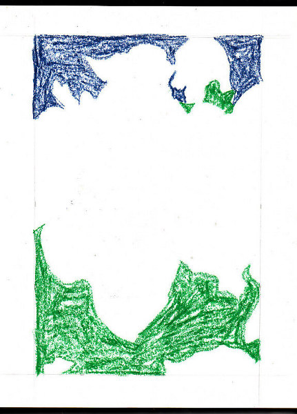
Step One - Draw from the Negative SpaceStart by sketching the outlines of the negative spaces around the pink petunias very lightly with an HB pencil or harder (F or any of the H grade pencils). Then fill those areas with flat color applied lightly, with lots of white specks showing. Don't worry about hiding your strokes. You can also sketch these lines directly with a green or dark blue oil pastel the way I did. Drawing around your main subject is called "drawing from the negative space." If you've never tried it, you'll be surprised at how much more accurate it is than drawing the subject itself. It eliminates the distraction of knowing that what you're drawing is a pink petunia, in favor of drawing the specific shape of that background chunk - which is unlike any other background chunk, but interesting in itself. It's much easier to get true proportions this way. Don't worry if a petal gets a little wider or narrower. As long as you get something close to the general shape, that's good enough. It'll still be recognizable as what it is. Notice that the big mass of the flowers shape goes off both sides, while all the corners are dark background areas. That's a composition trick to help make the scene more intimate and keep the big flower the central focus. You're so close that the flower goes outside the edge of the picture, so that implies the whole garden continues. Dark corners help guide the eye back into the picture. Just fill it in loosely with a light texture in a dark color. I chose dark blue for the upper background areas to keep them darker and more distant, while the sunlit foliage in the front makes a strong contrast to the flower's nearly-red tone. This painting has a red-green color harmony. We'll use other colors to modify them and make them richer, but red and green are the predominant hues. Check the shape against your photo reference or my example. When you get it as close as you can, go to the next stage. Don't work too heavily in correcting this first layer or try for heavy filling-in. I left plenty of tooth on the paper, bare spaces for the other colors to catch hold when I added over this base layer. Sketchbook paper only takes two or three heavy layers at most, so it's better to work lightly until the very end.
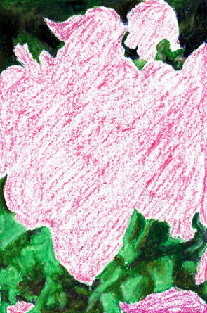
Step Two - Refine background, add base color to flowers massGo over the top background area more heavily. Create random foliage shapes by blending over the dark blue with green, bring in a little violet into some other shapes. Think of partial leaf shapes cut off by both the edges of the picture and the edge of the empty flower mass area. You can pick out some areas with highlights by using a lighter green or yellow over those, but keep the top area quite dark except for accents right next to the wilting pink petunia at upper right. Down in the bottom area, start picking out leaf shapes and crumpled leaf shapes with dark blue, violet and dark brown - any of the deep colors in your set. Start modifying some of them with yellow ochre. Use olive green to add some yellower leaves. Again, think in terms of leaf shapes cut off by adjacent shapes including other leaves. It's more important to give an impression of massed foliage than to show individual leaf shapes in this area - the central pink petunia is the main stars of the show, these leaves are supporting actors. So be vague and change direction often. Follow the shapes I used or create some of your own. Then fill all the flower and petal shapes lightly with the darker pink, sketching so lightly that it appears light even though that's the darker color. This establishes a general hue and unifies all the pink petunias together when later we'll be shifting some of them warmer or cooler, darker or lighter.
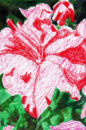
Step Three - Shade the Pink Petunias with RedLook closely at the pattern of shading on my example sketch. Right in the center is a little irregular light patch that's going to become the stamens and pistils of the flower. Around it are some red lines that spread out into the flowers, making them three dimensional. As petals bend over, shadow areas become darker. Some of my red areas are very solid, because I'll modify them with even deeper darks. Others are just lines. Some red patches will become crinkles in the petals when highlights and mid-tones are added around them. Even at this stage though, the pink petunias have dimension and shape. You can see that the wilted one at the upper right has petals dangling down from the center, while another one may just be opening next to it. These red triangular and block and line areas all create shape and texture to the rumpled petals. If you're working from your own photo, then look carefully at where the main shadows are. Follow the shadow shapes in relation to each other, without worrying about variations in the lighter areas. This is the same mental trick as drawing from the negative space - if you draw the shadow shapes the right size and shape and placement to each other, your main pink petunia pops out as looking real with only two color areas. Your secondary flowers also start looking three dimensional. Work a little more on the background, refining leaf shapes and adding more yellow ochre, olive and orange to warm the foreground foliage. It still looks too much like bright green plastic rather than the natural green of plant leaves, but in the final stage we'll refine the color farther by adding yellow ochre or olive green to all the bright green areas.

Step Four - Finish by shading the flower petals and refine everything.To complete the painting, sketch in the light highlight areas firmly with the light pink pastel. Do them separately where they fall, the same way that you did the red crinkle areas in the middle of the petals. Just follow the example and place them where they belong. The light is coming from the left and a little above, so shadows will fall to the right. Place highlights mostly to the left of shadow areas, but also use them to define the edges of separate petals. Then blend over the mid-tone areas with the darker pink. Feel free to blend right over the red areas, that creates smooth soft edged shading inside the pink petunia. Work outward from the center with short strokes so that you don't have stroke direction breaking the impression of the petals. Pink petunias have a veined, crinkled appearance, so strokes that radiate outward and overlap create some hinted veining just by their texture. Use the green again to darken the deepest darks in the red areas, sketch around the center stamens with it and go up only where the deepest darks show - a couple of lines but mostly within the center trumpet of the main pink petunia. Go over the green again with red so that it becomes a deep dark red. Bring a little of the red into the darks between the foreground leaves and go over those with yellow ochre. I eventually added orange or yellow ochre over all of them to break the "green plastic" look. Now working intuitively, add a little bit of orange to some of the areas where dark pink and red meet. On the wilted pink petunia and the petals at the bottom, use some magenta and purple to make those look like they're a more purplish pink. What this does is push attention toward the big pink petunia in the center because it's just a step warmer - it's catching more sun. It's a little off center so that it doesn't have a static composition, but fills the area so much that it's clearly the subject of a flower portrait. Use a little violet and dark green to deepen the darks inside the trumpet of the big pink petunia. Then mix light yellow and just a touch of lavender on the stamens with a lot of white to make that mixed neutral color pale. Experiment with the light colored pastels in your set to get the right mix on a side scrap if you don't have lavender and light yellow. Use the red and orange in the dark areas of the foliage to unify the background with the flowers. Using the green to deepen the red inside the flower also helps to unify it. Finish by burnishing over everything with the lighter colors used in the area and burnish the deeper shadows with red or your darkest green depending on where they are. Finish with touches of black used lightly into the deepest darks around the stamens and between leaves in dark areas. Brush off the crumbs with a soft drafting brush, or turn the art upside down over a wastebasket and bang the back of the paper to shake them loose. You can also blow them off with an air can such as you'd use to clean your keyboard. There are many techniques for crumb control , all of them are a good idea if you're doing this in a sketchbook to keep this painting from smudging the opposing page. I finished off with two light coats of Sennelier D'artigny oil pastel fixative just to be sure of preventing smudging. Using these stages, you can draw any flower in your garden, not just pink petunias. Oil pastels are a great sketchbook medium for flowers, since you can get such large assortments at minimal cost. Sort out your pastels so that you have multiple values of the main color of the flower and use as many greens as you have in the background along with blues and violets. Have fun!
|


