


|
Product Review -- Caran d'Ache Neopastel artist grade oil pastels.
This product has a medium texture for artist grade oil pastels, it's the third softest after Sennelier and Holbein. Somewhat high priced like many Caran d'Ache products, Neopastels are not overpriced for their excellent quality since they spread very far on the page. Caran d'Ache Neopastels were introduced in 1965 and are frequently mentioned in Kenneth Leslie's Oil Pastel: Materials and Techniques for Today's Artist. While they aren't the softest, they're a good contender for the smoothest with an easy, buttery texture that makes blending a dream. They are very opaque, something that makes them useful by themselves or with other oil pastels. They are versatile and just right for my personal hand pressure and favorite working techniques. Heavily pigment saturated, they spread very far when I'm blending out a loose application with a Color Shaper. One of the advantages to artist grade oil pastels is their coverage. While they cost more per stick, the stick will cover more square inches of your painting. Thus the high pigment saturation of the Caran d'Ache oil pastels is a bonus if you're going to create large paintings -- they won't wear down as quickly as cheap ones will. Below, you can see a realist painting I did with my 12 color set on Colourfix sanded pastel paper, the surface was Wheat color before I covered it thoroughly with opaque layers. 
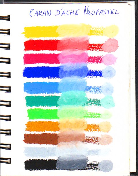
Great results with a short rangeBecause of the price, I purchased a 12 color set of Caran d'Ache Neopastel oil pastels. I wasn't sure if I'd like them when I tried them, they seemed a lot like the cheap ones I'd tried when I just looked at the product photos. Round small paper-wrapped sticks and all colors are nontoxic -- but they are magnificent. One of the reasons I felt confident about purchasing only a 12 color set was a close look at the exact colors in the twelver. These are good mixing colors. Some small sets don't give you the basic mixing hues, but this set has both a bright slightly orangy red and a strong magenta, a deep violet-blue and a warm sky blue leaning toward green, a dark but pure mid-green and a bright yellow green, a dark brown, yellow ochre, light gray, white and black. I knew that I could mix any hue using this selection and I was right -- the realistic little painting above was done entirely with just those twelve colors. I blended some striking muted blue-greens, purplish shadows, unusual neutrals and olive greens as well as pale yellows and lemony yellows from the pure yellow in the set. The colors in the twelve color Neopastel set are great for a color matching perfectionist. The buttery texture and high pigment saturation allowed me to blend more and more white into mixed hues to get lighter tints without sacrificing clean hues. My neutrals didn't turn muddy. That makes this twelver my favorite pocket set and I know I'll refill it many times over the years. The full range is 96 colors and includes quite a few bright tints, which make it excellent for a "Colourist" approach to painting. Sgraffito works well because of the opacity of both dark and light colors -- you can cover an underlayer well enough to scrape it back and reveal a dark or light contrasting color. Opaqueness diminishes in the dark Erengi hues, but the dark brown and deep blue-violet stayed opaque and allowed more deep opaque mixtures. All of the set sizes come in hinged metal tins with styrene trays to hold each pastel clean and separate from its neighbors. The tin snaps shut solidly and a plastic foam layer is included to keep the pastels from jumping out of the tray. Keep that little foam layer, it's important later on when your set gets a bit banged up to keep little pieces from banging into other colors. The full range set is also available in a handsome wood box with two trays (one removable, one the bottom of the box from what I can see in the photo.) The wood box set is a luxury, its price is extravagant compared to the cost of the tin set. These are also available online at Blick and most online suppliers in open stock and sometimes the open stock prices add up cheaper than purchasing sets. Sometimes not, it's good to cost it out before deciding how to buy them. When carrying Neopastels out in the field, it may still be good to put a rubber band around the tin. Sometimes banging your messenger bag or pack into something can cause a tin to jar open and drop your soft squishy pastels to the bottom under other things, where they'd get all over everything, get dirty and hard to remove the stains from the bag and other products. Better safe than sorry, in fact I'd do this with everything but my wood box Erengi set as cardboard boxes do that too. Here is a color chart of eleven of the twelve Caran d'Ache Neopastel colors I have, with White added to each of the bars to show its tint. I blended the edges of the tints together to show how smoothly these create soft edges and gentle transitions. Notice the relatively clean edges of the color bars where they aren't blended. This brand gives me the most precise control of mixing, hue and edges of all that I've tried.
I'll add a larger color chart when I get more colors, which I'm definitely planning to do soon! The only reason I've been able to put it off and purchase other brands sooner is the well chosen small range of the 12 color set -- every color is a perfect mixer. Here we go! I purchased a 48 color set from Blick Art Materials
My scanner altered the hues in the center row third and second from the bottom. Third from the bottom is a pale yellow, second from the bottom is lemon yellow. Despite adjustments the pale came out pinkish and the lemon yellow a little too green, while a light olive came out looking more yellowish. Also the Prussian blue in the right hand column is much darker. It's hard getting all of these colors to read true on screen but when they're printed, they are much truer to the original artwork.

|
