


|
Product Review -- Holbein artist grade oil pastels
I hadn't done a good example painting with my 100 color Holbein set as of January 8th, 2009 because it just arrived that afternoon. While I was making the color chart, each color inspired me as I laid it down. I did one today, on January 11th -- record speed for me between arrival of a new art supply and doing a new artwork with it. Holbeins are luscious! This is a stone study of a Cretaceous leaf fossil my daughter gave me on my birthday three years ago. It became one of my favorite still life objects and also launched me into building a fossil collection again. I set it on top of my slightly shiny black external DVD/RW with a window behind illuminating it directly and a bit of muted light from a window to the right causing a subtle double-shadow effect.

Cretaceous by Robert A. Sloan, 3 1/2" x 5 1/2" on gray Canson mi-Tientes paper in Holbein oil pastels. The systematic arrangement of tints in my 100 color Holbein set reminded me of so many things in nature that have perfectly smooth gradated shading -- the sky, the turning of a leaf, the petal of a flower. It'll be hard to resist doing monochromes with these Holbeins. Here are a couple of photos of my set that I snapped with my phone camera and brightened in Kodak EasyShare software:
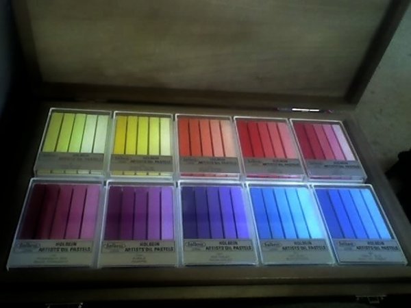
Holbein 100 color wood box set, top tray
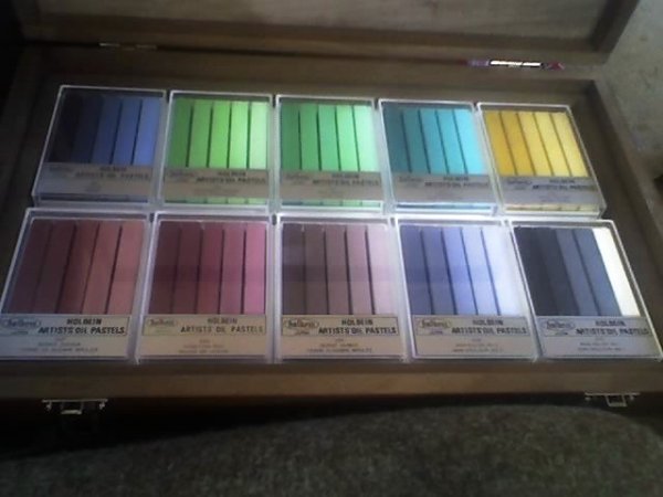
Holbein 100 color wood box set, bottom tray showing the strong range of browns and greens plus Indigo, the third blue and two sets of grayscale sticks.
Pigment-Rich, Soft, Classy and OrganizedHolbein is an old, established art supply manufacturer with top quality watercolors, oils, pastels and other mediums as well as oil pastels. It should be no surprise that their fine art oil pastels are systematically organized in a way that makes sense both to the traditional painter looking for specific pigments and to the Colourist looking for gradated tints of each pigment. The wood box my set came in is oak-stained with shiny nickel-plated latches and hinges. The lid stands up vertically, it doesn't drop back flat to hold the top tray the way so many other wood art supply boxes do, which is a minor disadvantage for laying out the trays. It's a minor convenience if you prop a canvas board or prepared pastel board against the lid to work with your colors in front of you. Each of the 20 colors with its masstone and four tints is packed into a small neat plastic box. The bottom's a sturdy little sectioned tray to hold the unwrapped 3/8" square sticks in order. #1 is the masstone, the pure color, each tint is a clear value stage lighter than the previous color. They are much brighter and stronger in person than in any of the online photos I've seen of the set. The top tray lifts out easily because it sits a bit under a half inch over the side of the box. The bottom tray can be removed easily if I take out one of the colors or move it aside to get a grip on the side of the tray. With both trays removed, the box can be set aside till it's time to pack up and put your supplies away. Even without lifting loops or tabs, the box is well designed and handy. I'm curious about what the new 145 color full range set will look like when they repackage that and produce it. I hope the design is as elegant as this design, because those little five stick boxes are very sturdy and it's easy to see the colors through the clear jewel-box lid. The color name and number are printed on a gold label on the lid. All of the colors are consistent in texture, soft, creamy and easy to handle other than a tendency to get my fingers sticky because they have no wrappers. Artists who like scumbling and using the sides of sticks will enjoy these immensely. Every color was opaque, not just the tints but the masstones, even the dark masstones like Indigo. Indigo is extremely dark in masstone, it's very near black and a satisfying deep shadow tone for mixed darks. As I handled each color to create the chart, it was almost a mystical experience because every one of these Holbein hues gave me an idea for a painting or a color harmony. It would be easy to combine Yellow Oxide, Burnt Sienna and Indigo as a primary triad for a low intensity painting that had a misty, autumn or wintry feel. Ten no-color hues including black and white invite the classical technique of creating a detailed grisaille underpainting and then glazing over it. Warm and cool yellows, reds, blues and greens suggest mixing possibilities while the presence of clean secondary colors like Antique Orange, Red-Violet, Purple and all those greens make me think of doing a bright landscape or still life where I mix all my neutrals. The storm of inspiration my new Holbein set caused is largely due to that unusual color combination. Smooth gradations are sensual. They are also convenient if you want to fool around with color and value. I could easily build up a cloud mass in light tints that would flatten out to a single light value but recede and push forward by the temperature of the colors. I've never had this many tints to play with in anything before, and playing with tints is playing with light. Holbein may have thinned its colors, but even two tints for every hue gives a freedom of mixing that's more organized and convenient than anything else. I purchased a Holbein Deluxe metal holder from Jerry's Artarama before I ordered this set. I didn't slow down to use it for making my charts because I was handling each stick only one, but I can see that stickiness and using the holder will encourage me to slow, careful, classical work with a lot of unity -- using each stick in turn and using it in several areas around the painting before changing colors. Convenience can create a style and a set of habits in itself. I'm sure by next year my organized Holbein set will become a messy box full of bits and nubs and stubs with smears of other colors on them. But right now its pristine organization cries out to transform it into careful, detailed realism or wild impressionism brimming with color. Here are my homemade color charts:
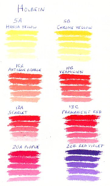
The first eight colors in the top tray suggested portraits and floral still lifes to me. The lightest values of Antique Orange are perfect pale skin tone highlights, and as I handled the #4 and #5 tints I couldn't help but think of my granddaughter's cheek. The two yellows are distinctly cool and warm, Hansa Yellow is lemon-bright and Chrome Yellow buttery warm.
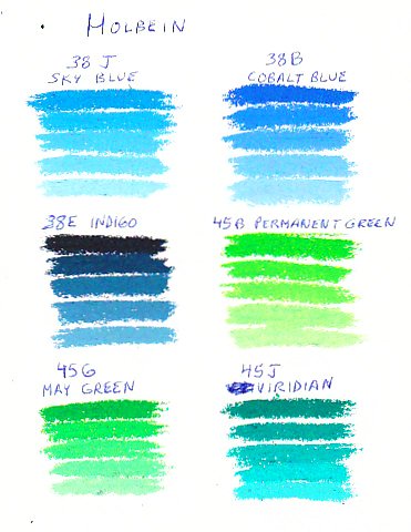
These blues and greens together make me think of reef scenes and forest pools. The hues balance elegantly at even distances from each other and the range of tints suggests easy chiaroscuro. I could have a lot of fun with light using these. One interesting trick is to start warming the shading one step as you go lighter, start with a cool bluish green and shade up but move over to the mid green and yellow green and eventually Hansa yellow by the lightest tint. This would warm the sunlight and make it sparkle on foliage. Doing the same thing underwater between Viridian and Blue-Violet would be gorgeous to give depth to a reef scene.
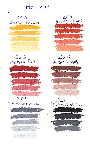
This is some of why I thought a muted painting, a rainy day or dim foggy forest would be so gorgeous and so accurate using Oxide Yellow, Venetian Red and Indigo as primaries and then only mixed secondaries to tone them. I may try this sometime. The full range is giving me way too many ideas. I'll have a good painting to post with this review as soon as it's finished, whichever of these I do to demonstrate how they look used by themselves.
|
