


|
Grass Texture

Grass textures, especially short clipped grass but also fields of tall grasses or crops, give beginners a hard time. I can remember when I would spend hours wearing own all the shades of green I had only to see a dismal result that looked just -- wrong. I'd mix colors trying to break it up and keep it from looking like a crayon drawing. Yet that still didn't help even though it should have. No one had ever explained to me about
descriptive strokes.
One way to get grass texture is to use a light, even tonal layer of broken color. I used that above, in Broken Dam, when I wanted to use the black paper for emphasis. At the very top of the landscape there's a lawn with some trees in it that slopes down to an undercut brown bank, then there's some logs and stones in the water, then the water as it flows over a high area down to a lower one between the pieces of the stone dam. In getting broken color like that, go very lightly. Just touch the paper with your oil pastel stick. Keep your strokes short and don't press hard at any point in the stroke, if it goes too light, go over the lighter areas again carefully. There are some tricks to it that I'll go into in more detail in my article on Tonal Layers, but in essence, less is more. Just don't press hard or make your strokes very long and don't overlap too much unless you're filling in lighter streaks. Here's an example of another grass texture, one I learned in the oddest way. I was a kid on a road trip out West when I saw some beautiful opaque watercolor paintings by a Pueblo artist. He created clumps of grass with just a handful of slightly curved strokes, flicking up in a clump from a base, then he put little tick marks at the ends of some of them like seed heads. It worked with a brush when I tried it at home. I practiced those strokes in a lined notebook with a pencil, trying to remember that cool simple way to draw grass textures. They looked real even in pencil or ballpoint pen. Ever since, that became one of my favorite ways to depict grass in any medium. If I'm not using a very fine line, then I omit the little ticks at the end for seed heads because they look clunky. Here's how that style of grass looks in oil pastel. I did this example in Niji oil pastels on my wirebound ProArt sketchbook, about 3" x 4". It doesn't take artist grade materials to use this technique, grass textures can be done with anything you have to hand.

It's very simple, just a quick example, but it also shows a shaded tonal layer for the sky and sea. I did use long horizontal strokes in the water because of the size of the sketch, but in a large painting I might not have done the water with strokes that went the width of the whole area. Certainly not with heavy hard strokes going the width of the area. Look at the shape of the descriptive strokes. They start clumped together at the base and spring out with a slight curve, like each one is a grass blade. I draw maybe five or six of them per clump, sometimes only three. They stand for hundreds and give the impression of a tall clump of grass instead of anything else. These are especially effective if you've got clumps of tall grass sapearated by areas of bare ground, or coming up between rocks. You can practice "clump of grass" with any drawing instrument you have at hand, burnt match sticks, free ballpoints, anything. Just doodle them. And if you use pens, thin line brushes or pencils, add the little dot after the end about the width of another dot away -- you'll be surprised at how realistic that gets. Just continue the line with a break in it at the tip.
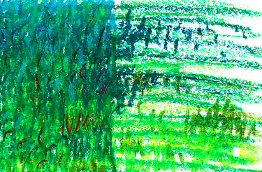
Short Clipped LawnsThat may be fine for wild dune grass, but what about a park or suburban lawn? I drew the same scene the way I might have done it when I was younger, not even trying to shade the hill. Example 2 is how NOT to draw a clipped lawn:

It was hard to force myself to draw the way I used to, and I didn't entirely succeed. The water is billowing like an overfull waterbed mattress and doesn't look real either. I went overboard giving the sky a heavy full saturation coverage and my strokes on the hill curved around the shape of the hill. They could have looked much, much worse. The hill could have had a hard outline filled in with horizontal strokes just like the water area. Either way, it wouldn't look like grass though. So how do you fix it if you do a painting and get the grass wrong? Is there a way to get good lawn textures after getting them screwed up? Yep. Let's do it wrong again on a whole page of lawn so that it's easier to see what I mean about "this is not how to draw grass." I'm going to goof up and then fix it.

There's my bad grass. It could be a problem area within a landscape or urban landscape. I did use one color trick to try to give it some dimension. I used three different greens over the first bright green layer -- bluer toward the top of the page in the distance, yellower the closer it comes to the front. But I just overlaid them with the same sorts of strokes and it doesn't look like grass. It might look like long green hair if it got turned sideways. To fix it, I started out by doing lots of short vertical strokes. Very short strokes, only about twice as long as they are wide, most of them straight up and down but sometimes leaning off to an angle. I resisted the urge to do zigzags. That can work later on when more layers are on there, but at first it's important to establish the short stubby vertical shapes of the cut grass blades. I did the area at the left solidly in the new texture, and put some isolated clumps of the grass texture on the right so that you can see how it looks in progress. Don't work back and forth mechanically in rows either. Try creating irregular clumps of short strokes and then add another color. I used all the colors I had in the first example, but by the time I had the grass texture established I could add even more. I used blues in the distance and some violets into shadows, went to adding some pure yellows and golds and even a reddish brown here and there as if some grass plants had dried blades. If you cover the part that's unfinished, you can see the left side is a recognizable lawn. It has some shadows from clouds on it, and the color progression makes it lay flat. Don't do your lawn in one solid shade of green. Use a variety of colors and try mixing some greens with blue, yellow, brown, gold, violet. Then bring in the bright greens with your mixtures for a full rich effect.
It takes longer to cover a large area with effective grass textures. But when your painting has a lawn in it and you give it that time for the short vertical overlapping strokes in different colors to make it look like a real lawn, it will jump out at your viewer as something powerful and beautiful. Descriptive, expressive strokes can be used for other landscape features too. I will be doing articles on other specific textures and showing how you can make clouds, water, foliage, bark and distant flowers look natural and true even in very bold colors. For creating a less textured grass effect, consider using the grass texture and then washing over it with odorless turpentine, rubber cement thinner or water if you're using watersolubles. Underpainting in the color you want the lawn will also mean you can go lighter and use fewer strokes. Once you have a full heavy saturated coverage like my example though, you can add any colors you like in small quantities and they read as variations rather than changing the impression of a bright green lawn. Till next time, enjoy painting grass textures in oil pastels!
|
