


|
Product Review: Loew-Cornell Aqua Crayons

Apple Blossoms by Robert A. Sloan in Loew-Cornell Aqua Crayons used dry on ProArt sketchbook.
Hard, firm and translucentLoew-Cornell Aqua Crayons are much harder than Loew-Cornell oil pastels, more like wax crayons in texture. I bought these some months ago in a set of 30 on Clearance from Dick Blick, they looked interesting and I wondered if they'd be anything like my old set of Caran d'Ache Neocolor II watersoluble artist crayons. The price both retail and even on Clearance was higher than most of the cheap brands of student grade oil pastels. Once it arrived, I noticed it had much better packaging than the Loew-Cornell oil pastels. A heavy duty hinged-lid tin has a white styrene tray inside to hold the crayons with a pony or camel hair blunt watercolor wash brush in its groove and a small palette area for mixing. I was pleased with the set and tested it out in my sketchbook. Loew-Cornell Aqua Crayons looked like oil pastels with round wrapped sticks flat at each end. A color list is in the cover in several languages, these are shipped all over the world. Used with nonwatersoluble crayons, they could produce some interesting partial-wash effects. I hadn't used my Loew-Cornell oil pastels in years so my expectation for hardness of this type of product was much on the hard side. They seemed all right. I set them aside, meaning to do something serious with them sometime since they were probably good student grade supplies. I didn't use them again until I bought my set of Cretacolor Aqua Stic watersoluble oil pastels. They are quite hard and waxy, much more like what I'd expect of a regular crayon than any sort of oil pastels. Pigment saturation is low, the white crayon was nearly transparent when I put it over a line of ballpoint pen in order to test its opacity. Washes on the samples in the color chart were weak, but clearly transparent. This is student grade transparent watercolor in crayon form, something that could prove useful to a watercolorist who's willing to be very patient about layering or picking up enough color for a strong value. The colors varied in intensity both dry and wet. Many colors do have pigment names though, so this could be a product that uses traditional nontoxic pigments such as Burnt Sienna, Yellow Ochre and Prussian Blue. These are intended as student grade art supplies and may be of some use to those that like a hard firm texture. They'd be good under softer watersolubles like Portfolio, but a heavy application would be necessary to get strong color for sgraffito effects. Here's an example of a quick sketch I did from imagination and then washed using the thick wash brush provided in the set:
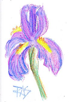
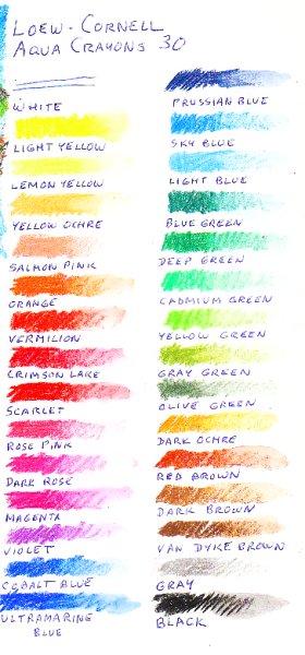
Notice how the original sketch lines in my washed Iris painting are still easily visible. Some blue lines in the lower petals were added after I washed the painting, to test whether these crayons would give strong lines drawn into water the way watercolor pencils do. They weren't much stronger than the blue lines already washed over. Still, Loew-Cornell Aqua Crayons may have a look that you like. If you have a heavy hand and prefer sketch lines to show in a sketch and wash technique, this brand may be for you. One advantage of a harder stick is that it's very easy to get sharp narrow linear applications. The crosshatching in the sky on Apple Blossom shows how easy it is to get a clean line with the edge of a stick that hasn't been worn down. I will be lightfastness testing the Loew-Cornell Aqua Crayons along with all of my oil pastels in Spring 2009. The tin claims this product is lightfast, so they may rate higher among student grade artist crayons than the texture would indicate. The specific term was lightfast rather than fadeproof, again an indication this product was designed for artists and serious art students rather than for children. Some colors that don't perform as well may have been chosen for being fadeproof over other colors that could be cheaper to add in stronger concentration. Below is a color chart, cut narrow on the left because it's right next to the two example drawings on a large ProArt sketchbook page:
|
